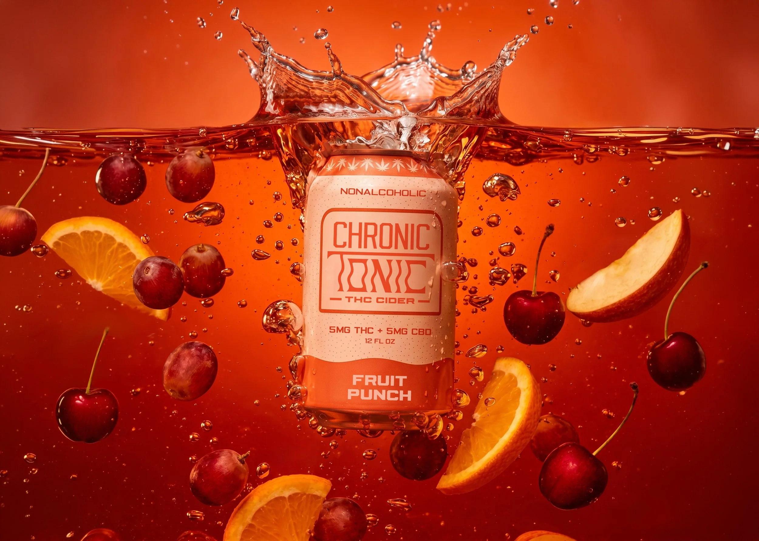
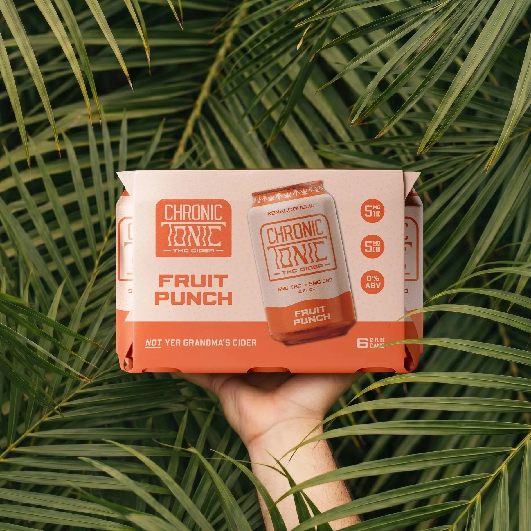
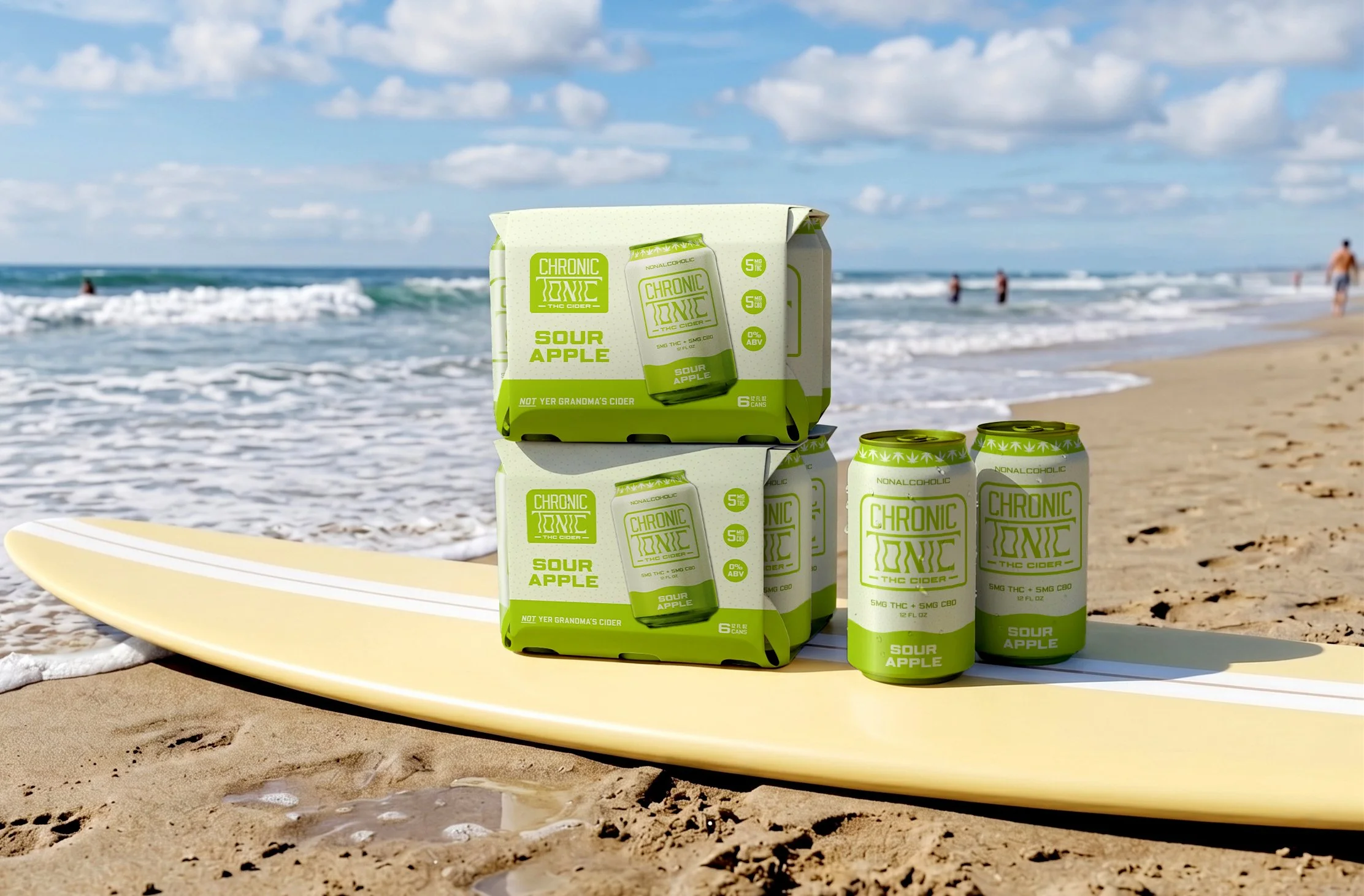
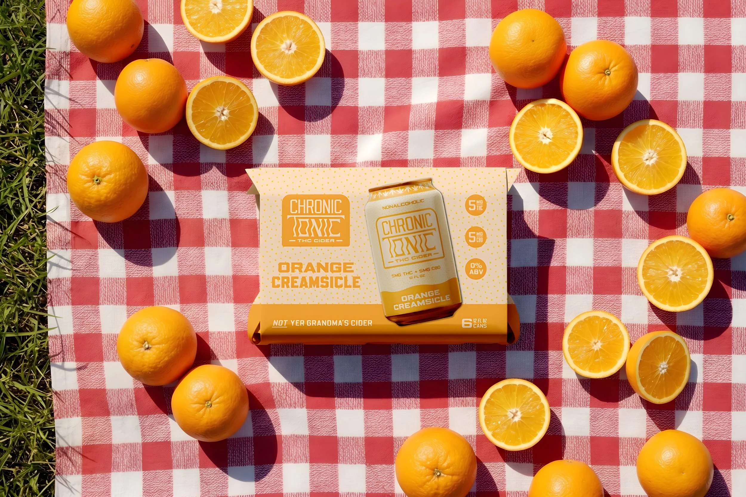
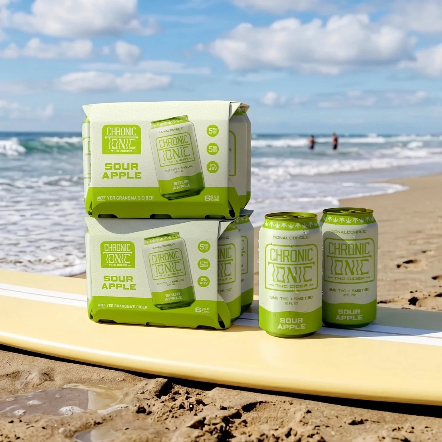
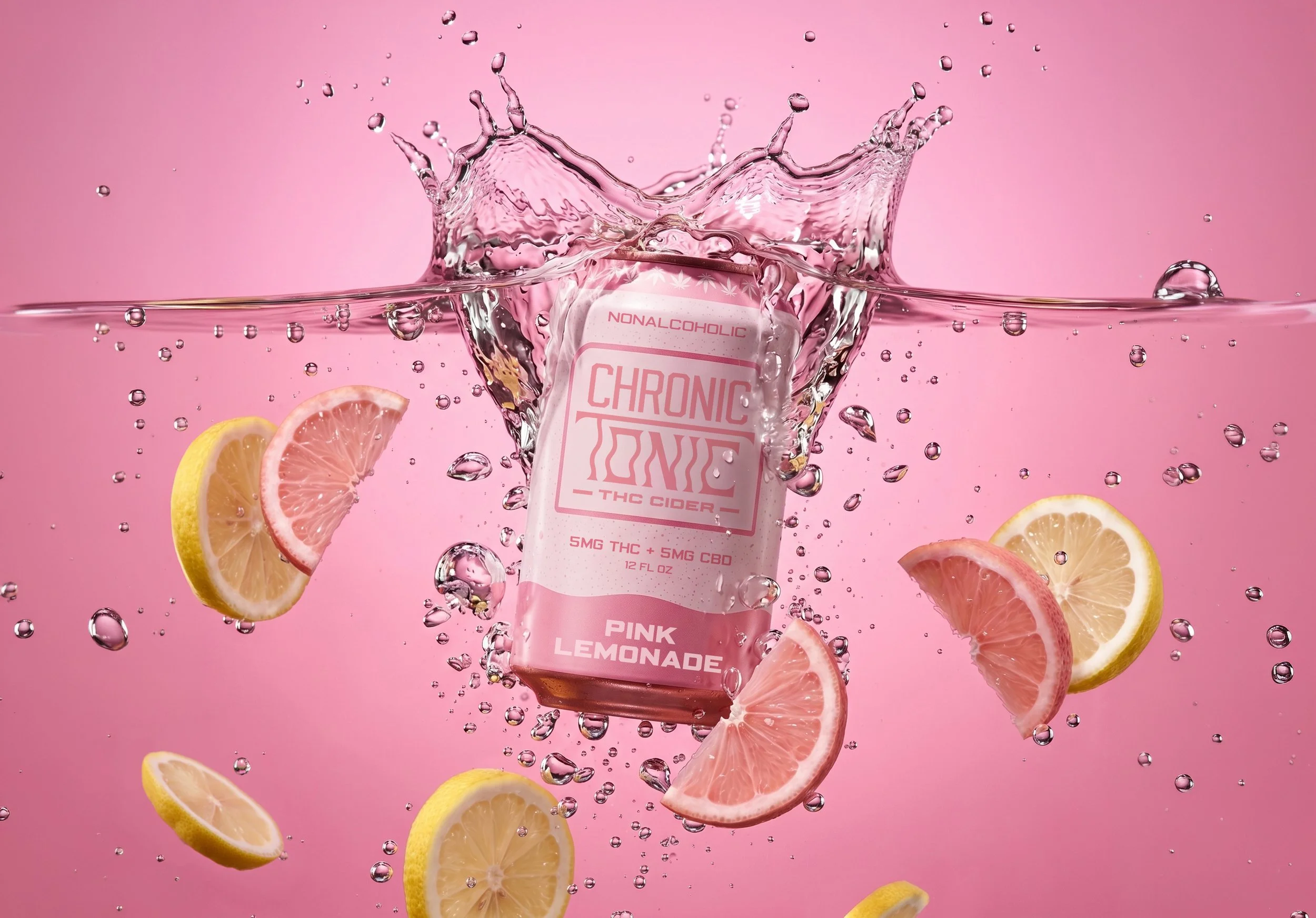
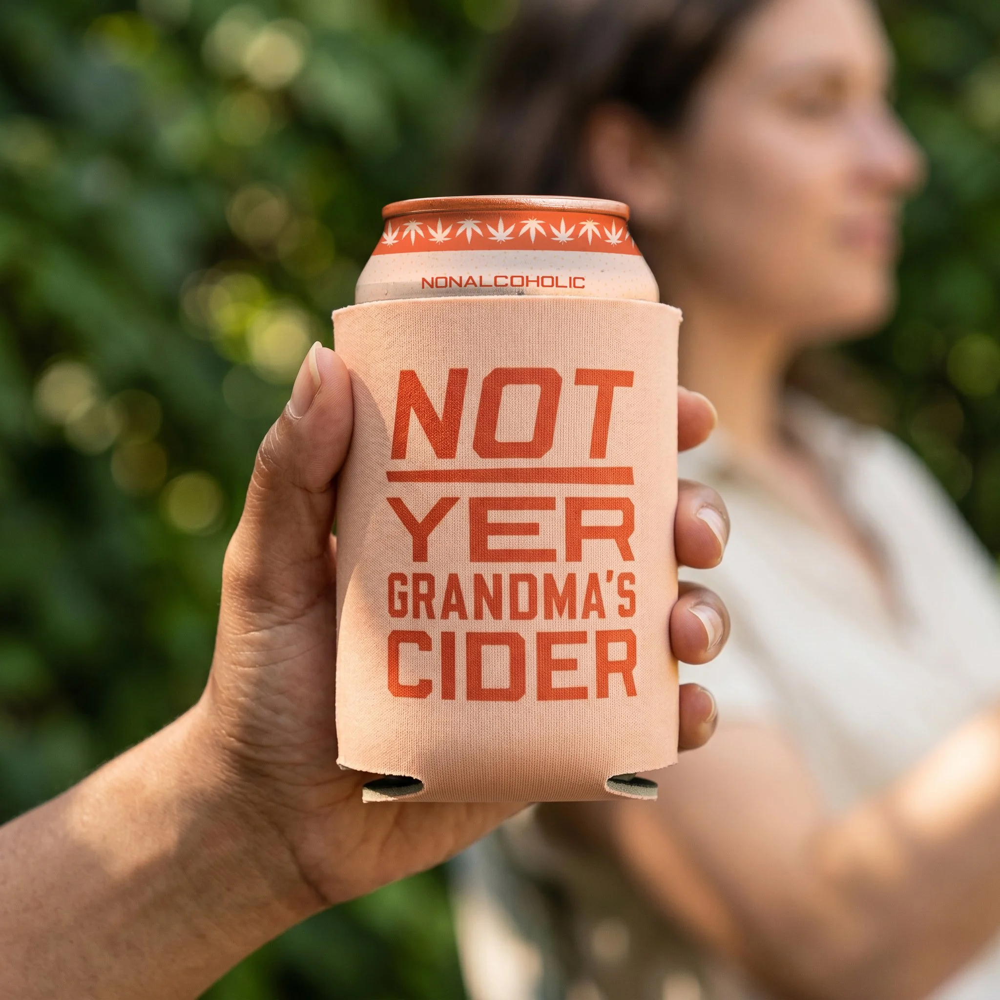
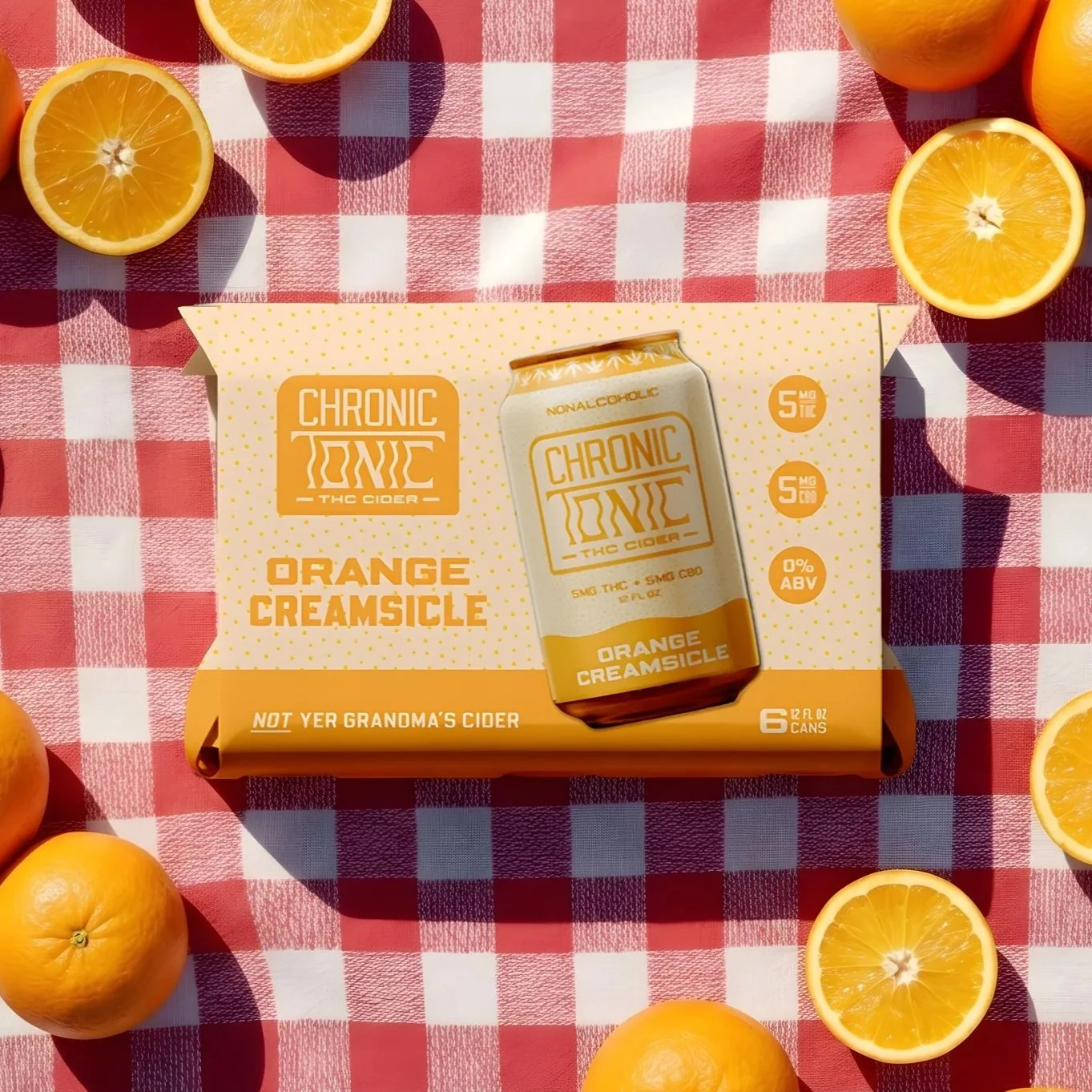
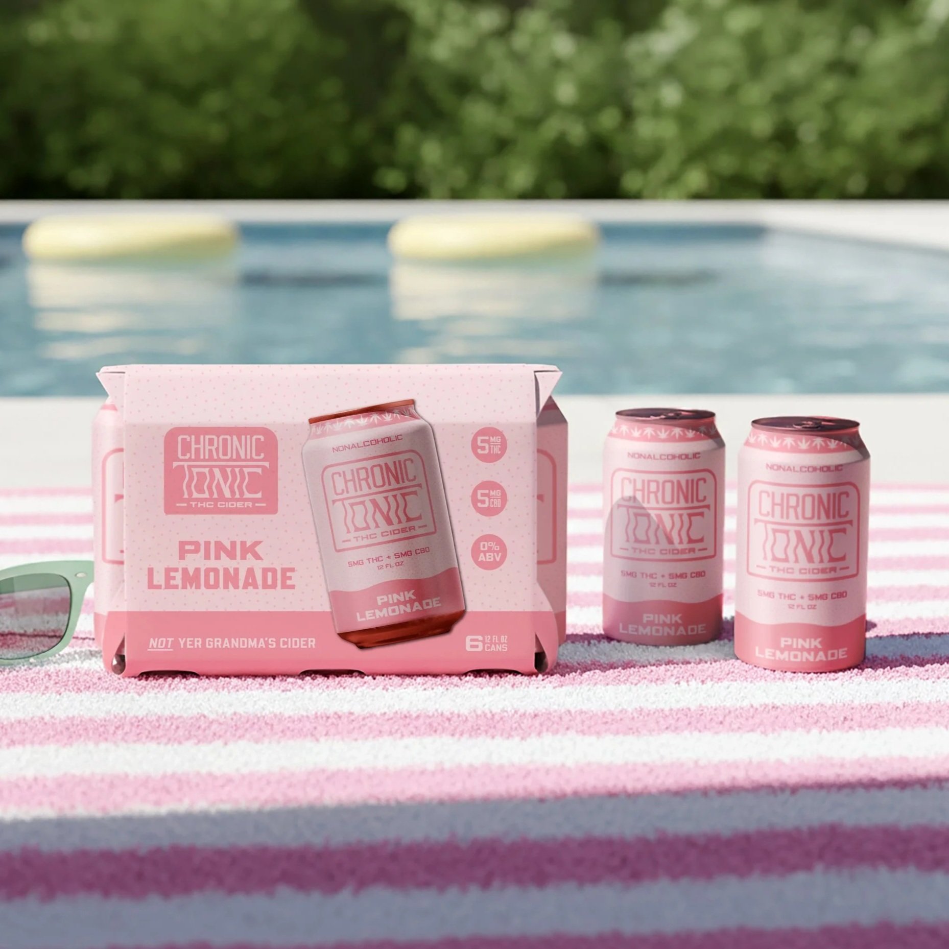
chronic tonic
IDENTITY | PACKAGING | MERCH
background
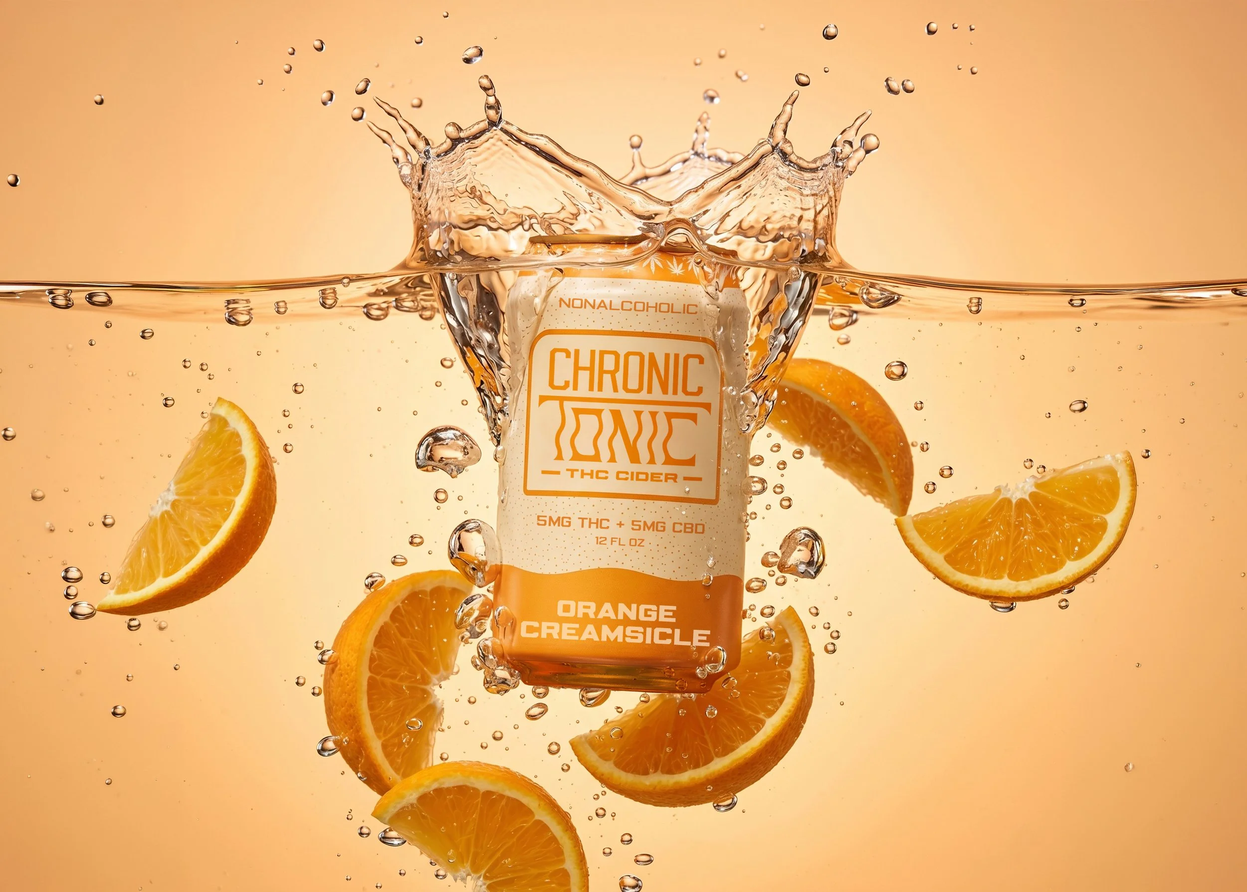
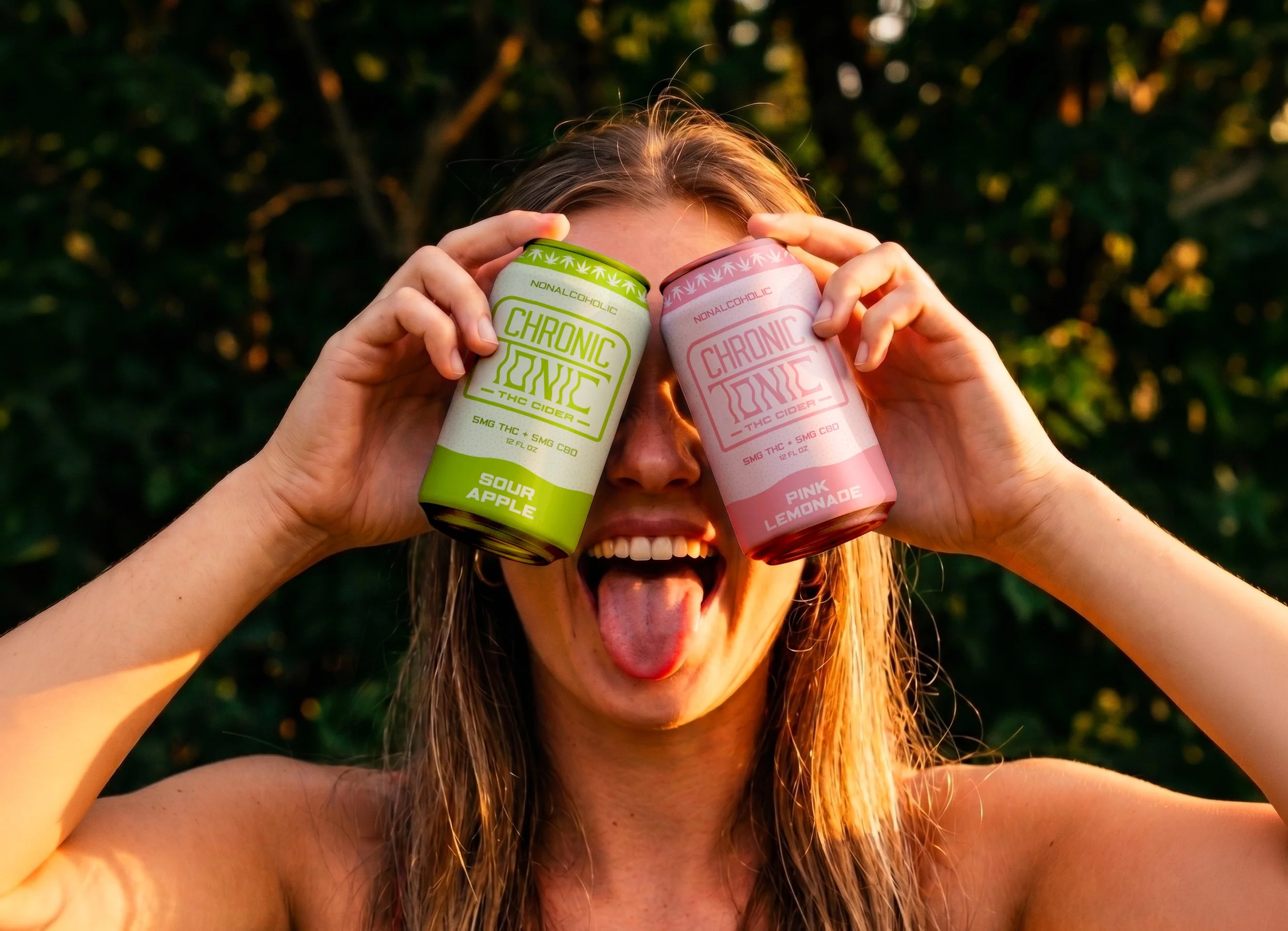
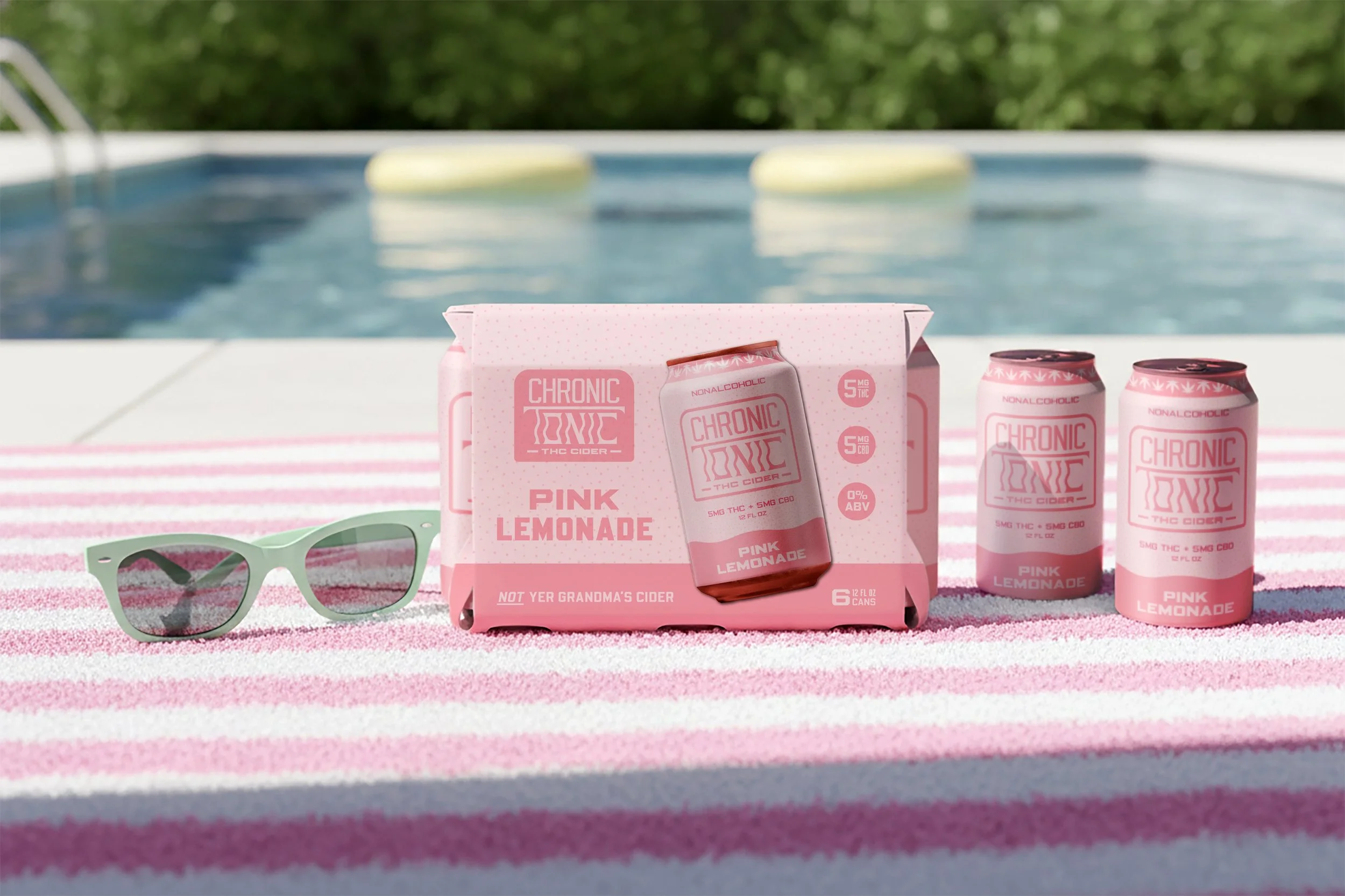
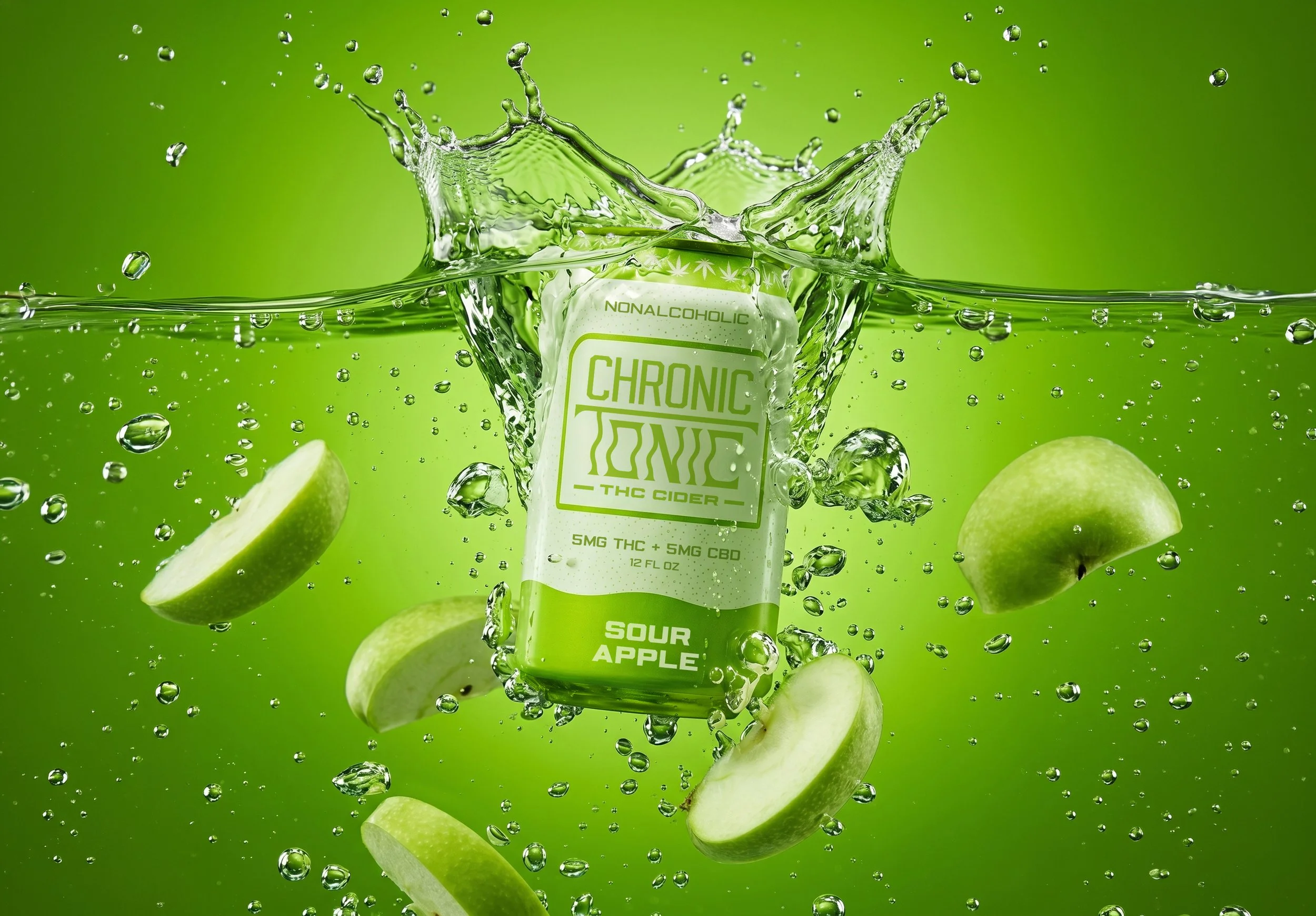
Chronic Tonic is a THC Cider brand that believes adult beverages should taste great and remind you of the good ‘ ol days - that’s why they’re proud to make THC Cider in the classic flavors you know and love, so you can kick back and enjoy your most refreshing (and nostalgic) high yet.
When starting the design process for this project, I knew I wanted to visually represent the sensations associated with consuming THC; so when designing Chronic Tonic’s logo, identity, and packaging, I employed contrasting senses of rigidity and looseness to mirror the physical process of finally releasing tension and relaxing after a long day. The stiff, angular type used for “Chronic” gives way to the loose, wavy type of “Tonic”, representing the shift from on-the-clock to off-the-clock. I also sourced inspiration from typographic packaging projects with strong senses of organic funk (Vicarel Studios’ packaging for Vanishing West Ciders and basically all of LAND’s projects were significant sources of inspo).