tropic blitz
IDENTITY | PACKAGING | ADVERTISING
background
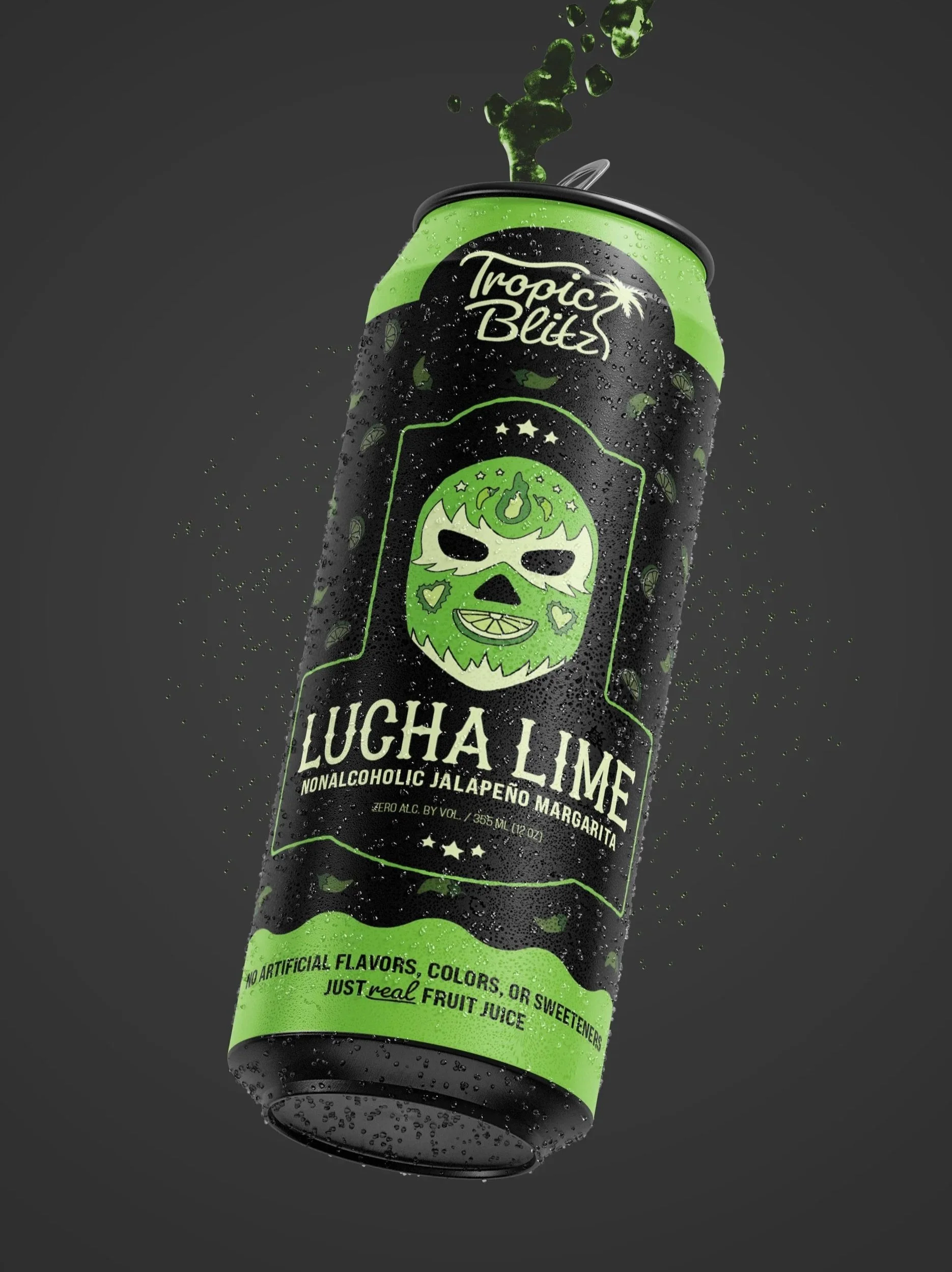
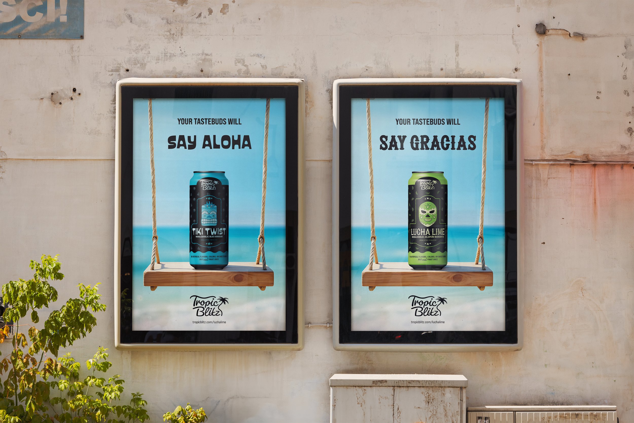
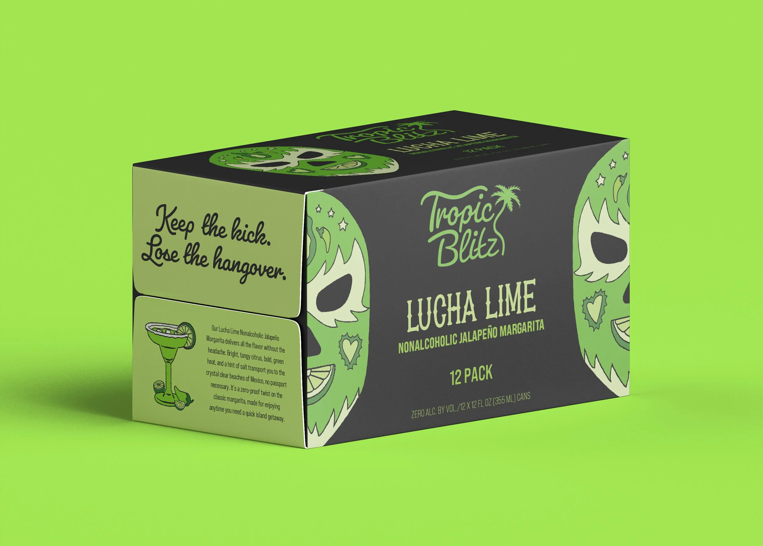
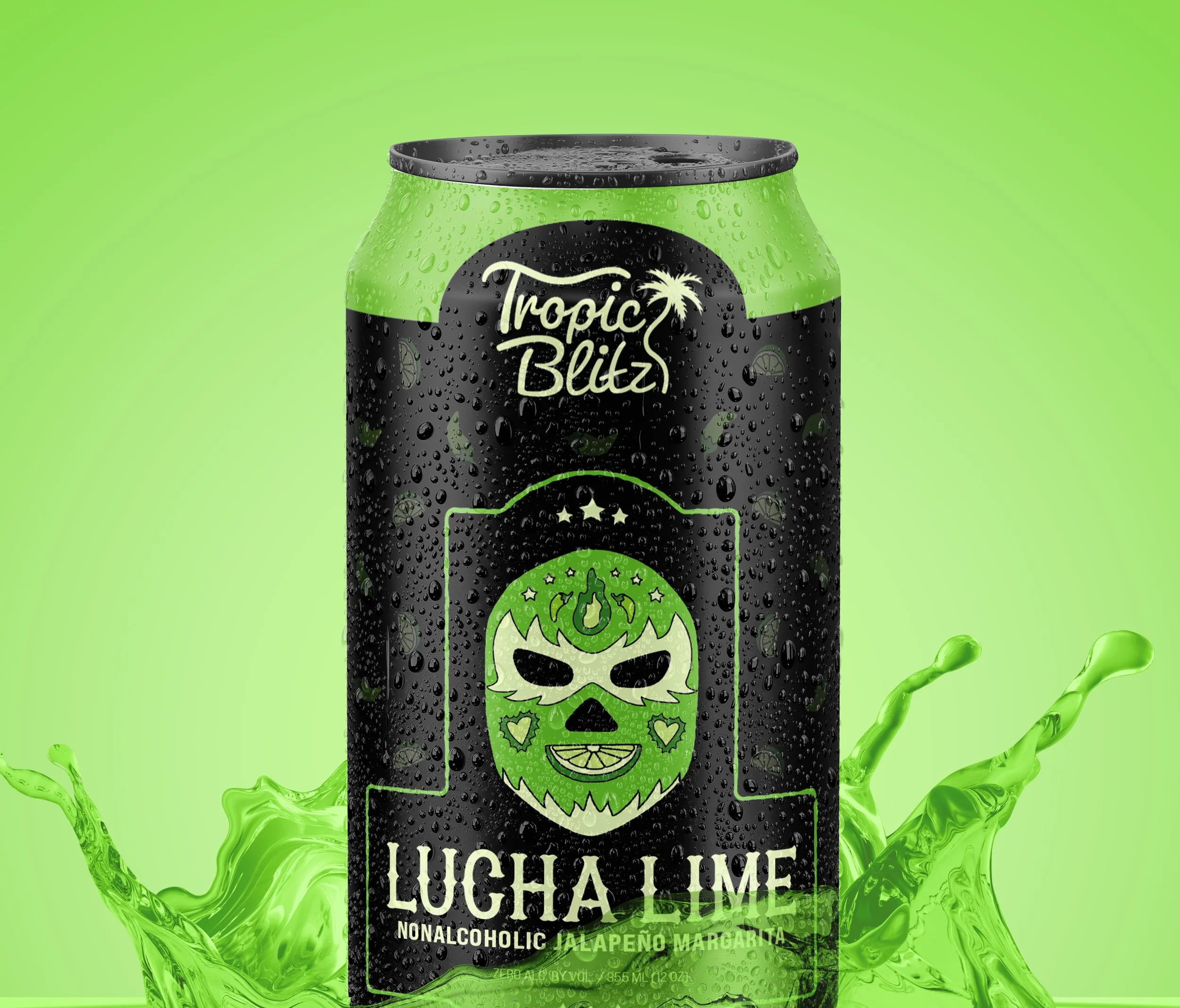
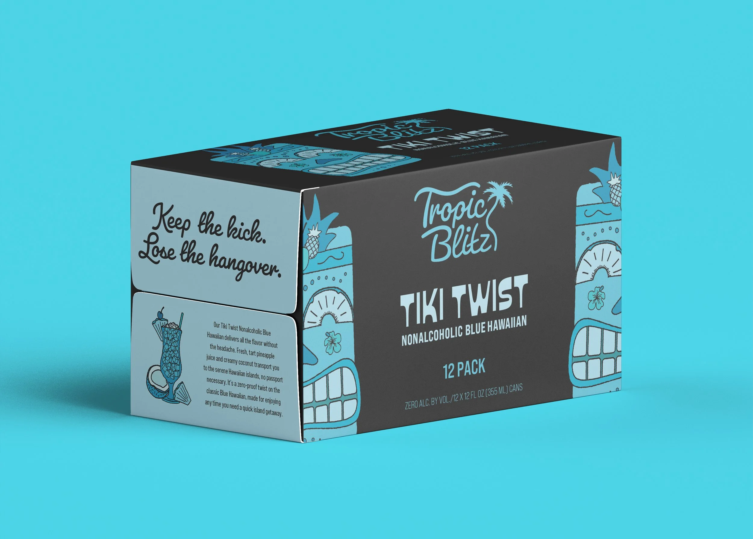
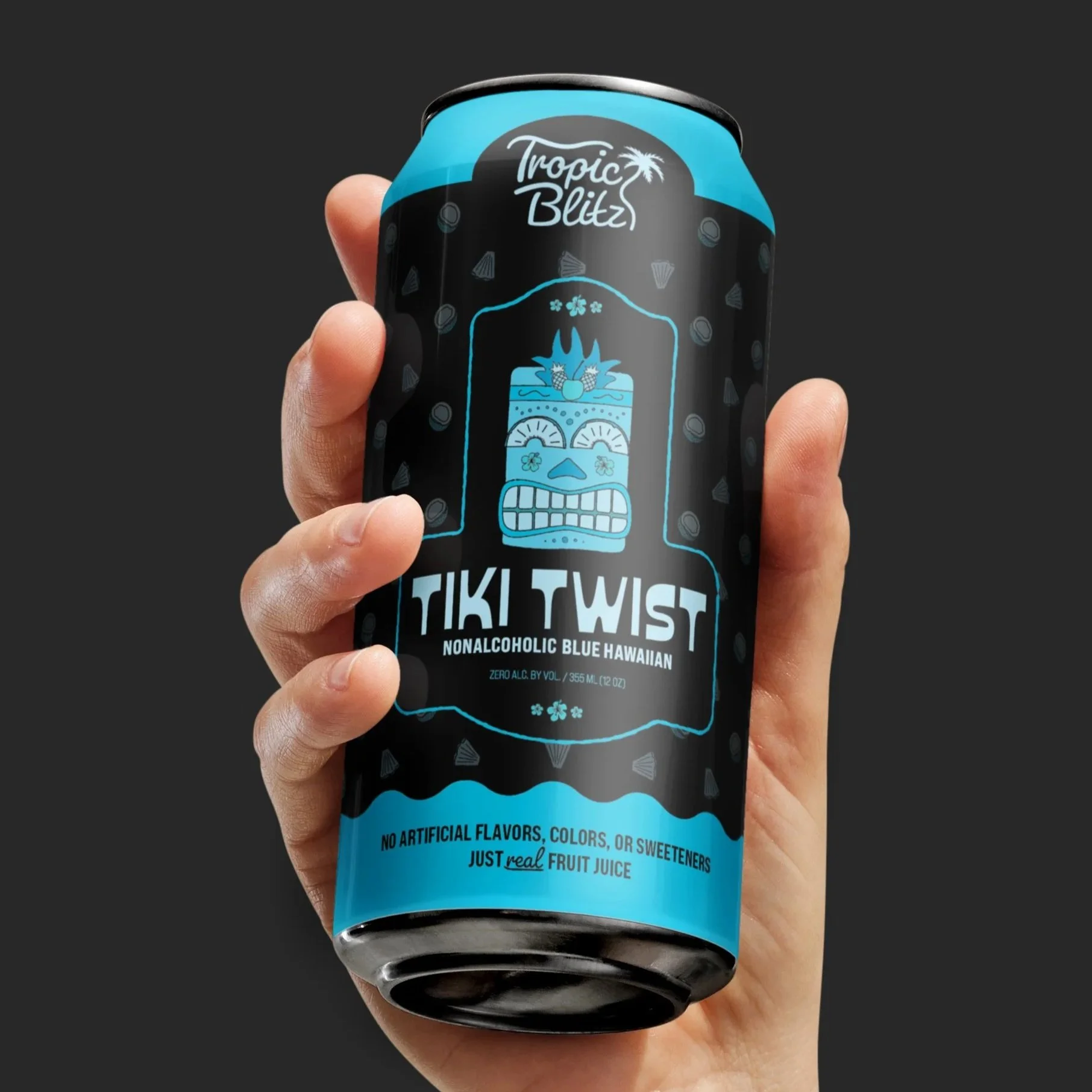
Tropic Blitz sells nonalcoholic cocktails inspired by tropical locations where bold flavors and good times are never far away. Whether you’re a reveler who wants to keep the party going without sacrificing sobriety or a weekend warrior in need of a headache-free tropical getaway, Tropic Blitz keeps the good vibes rolling.
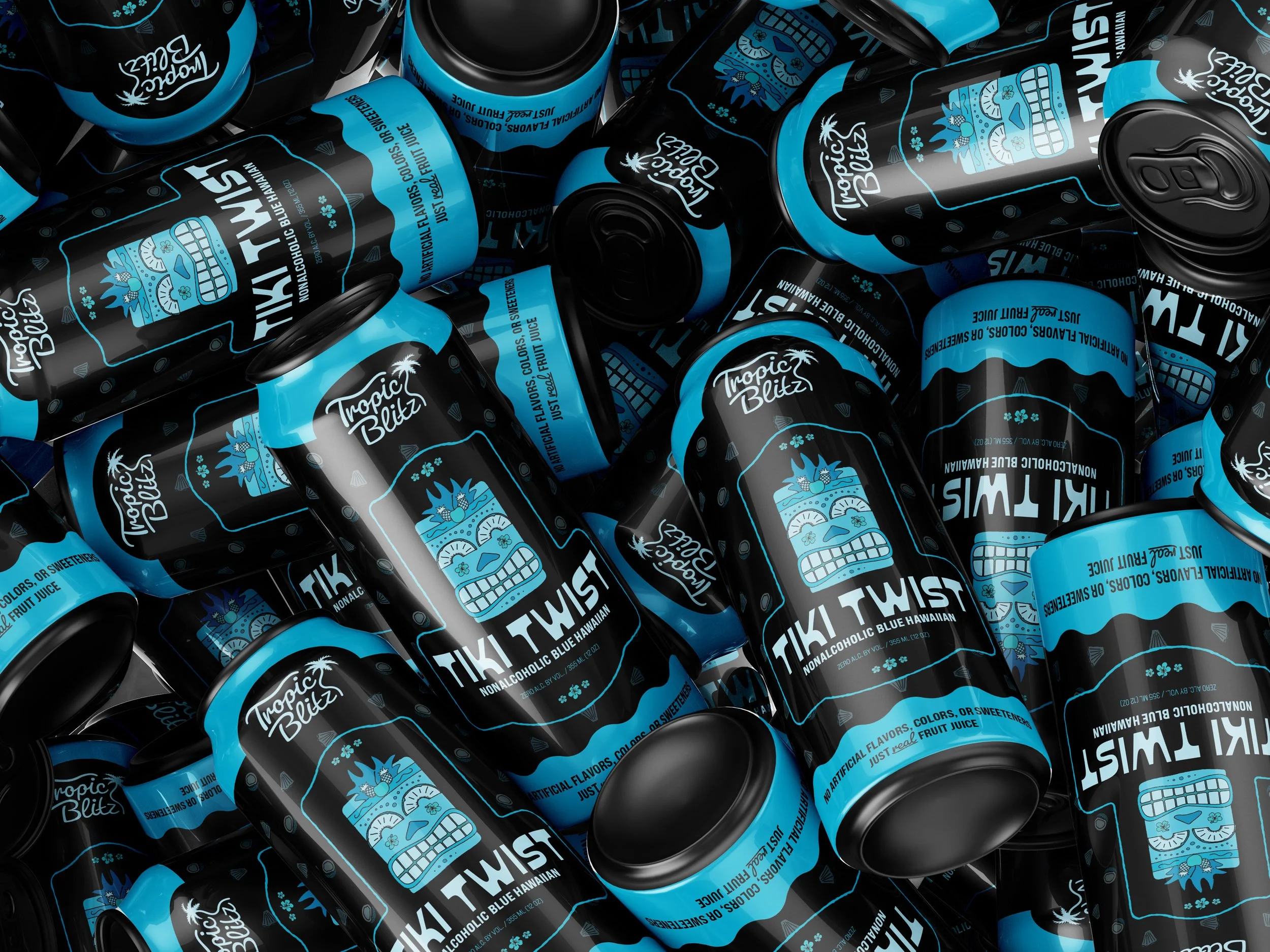
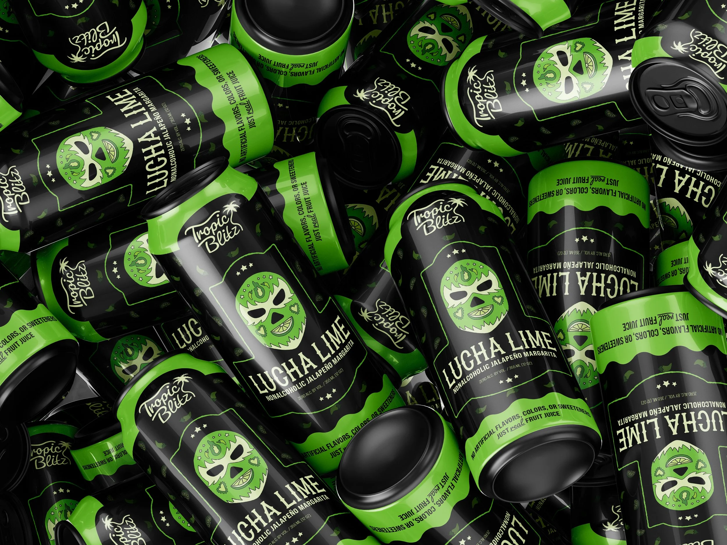
This nonalcoholic cocktail brand needed a bold, edgy visual approach worthy of a place in the beer aisle. To achieve this, I took a hand-drawn, texture-heavy illustrative approach and used vivid monochrome color palettes that create a “fully-drenched” effect, almost as if the illustrations themselves are saturated with the product. Swapping facial features with fruit slices on the character heads added some cheekiness, and I chose a different display typeface for each flavor name to bring some unique funk and character.
I built the branding system outwards from the illustrations I did for the individual flavors and united everything through composition and pattern, a near-black background, and a brand logo with groovy customized type inspired by ocean waves and the wobbly, undulating effects associated with traditional alcoholic beverages.