venus
IDENTITY | PACKAGING | ADVERTISING
background
Inspired by the Roman goddess of love and beauty, Venus crafts exquisite fragrances that embody sophistication, allure, and divine femininity. Each scent is a carefully curated symphony of the finest ingredients, blended with artistry to create a lasting impression that awakens your inner goddess.
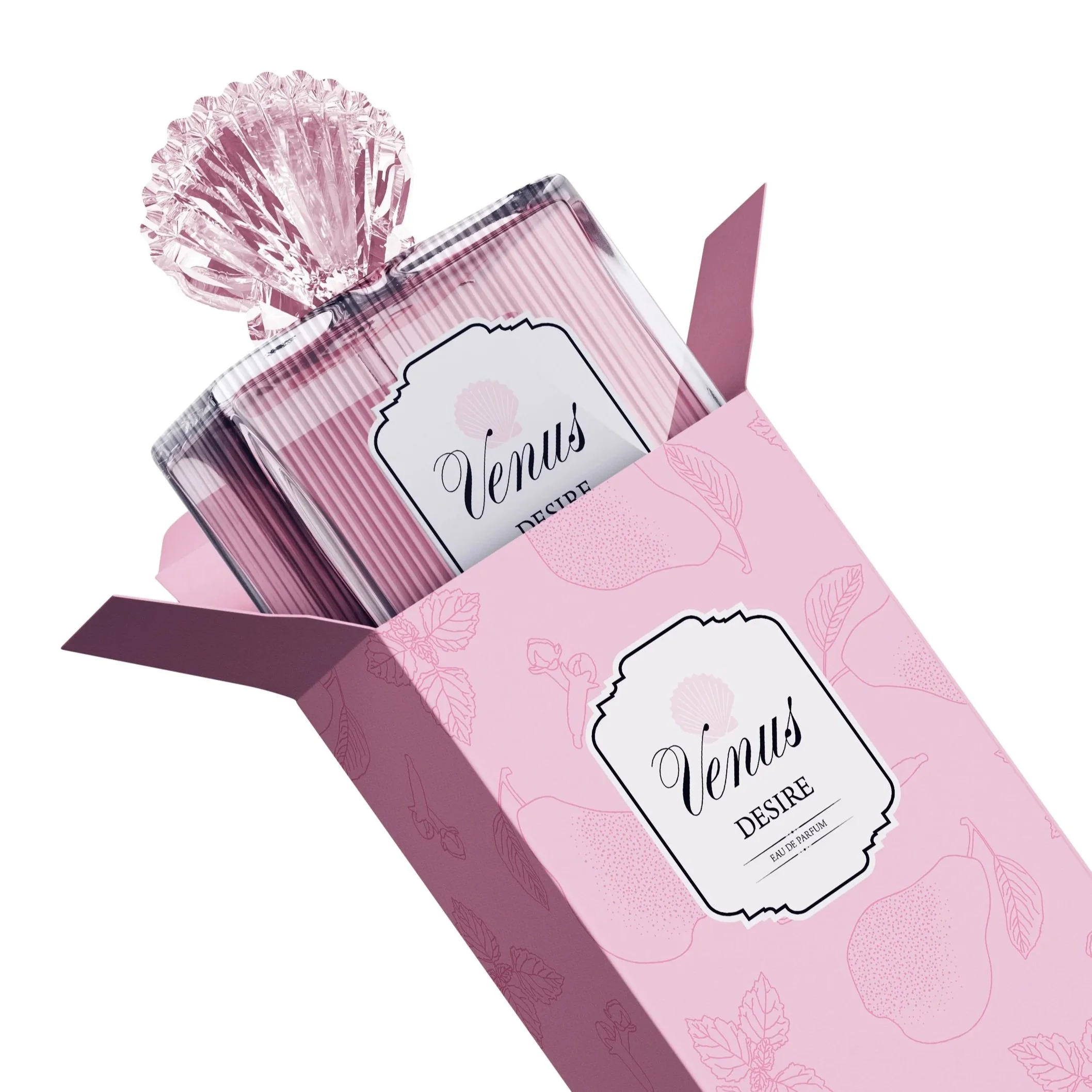
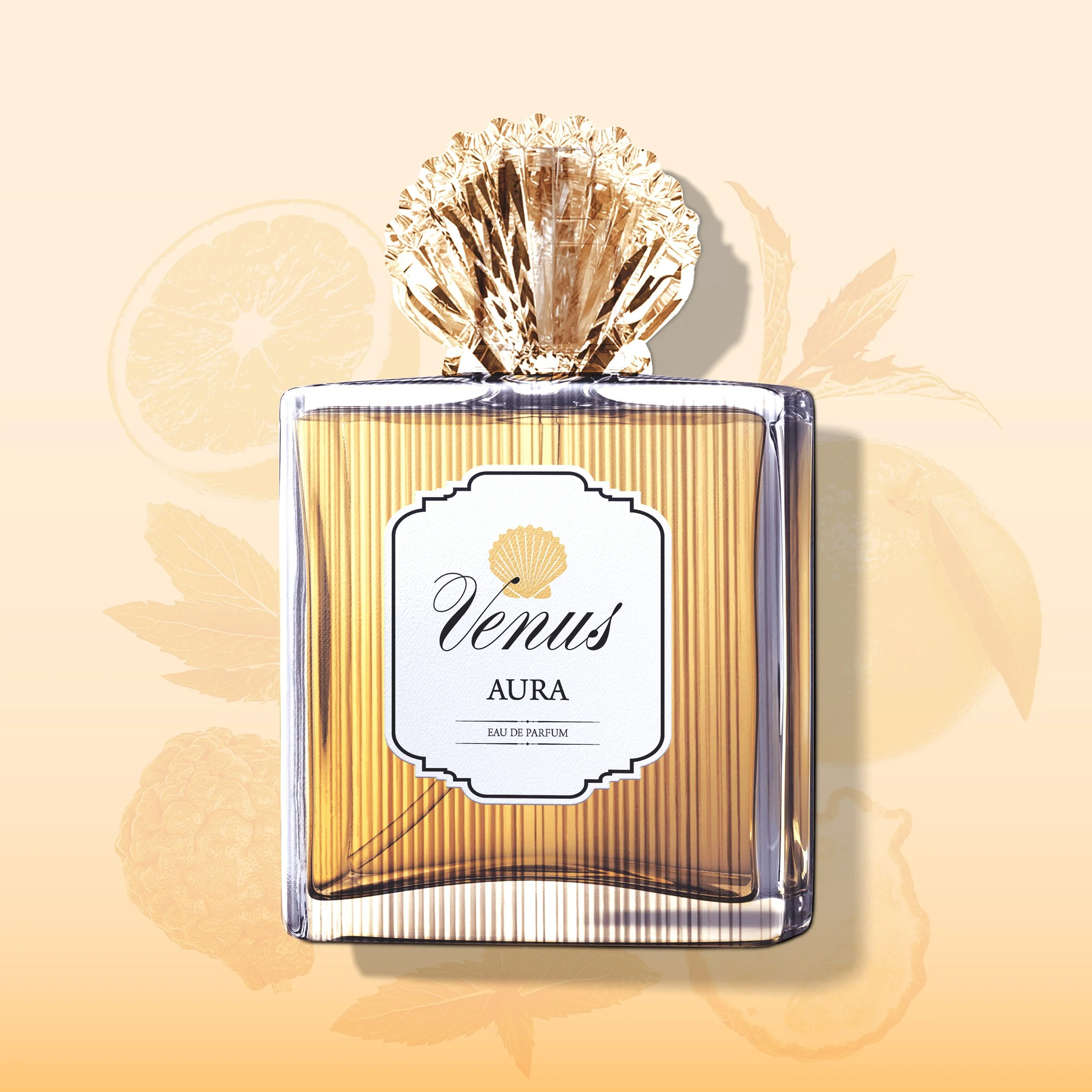
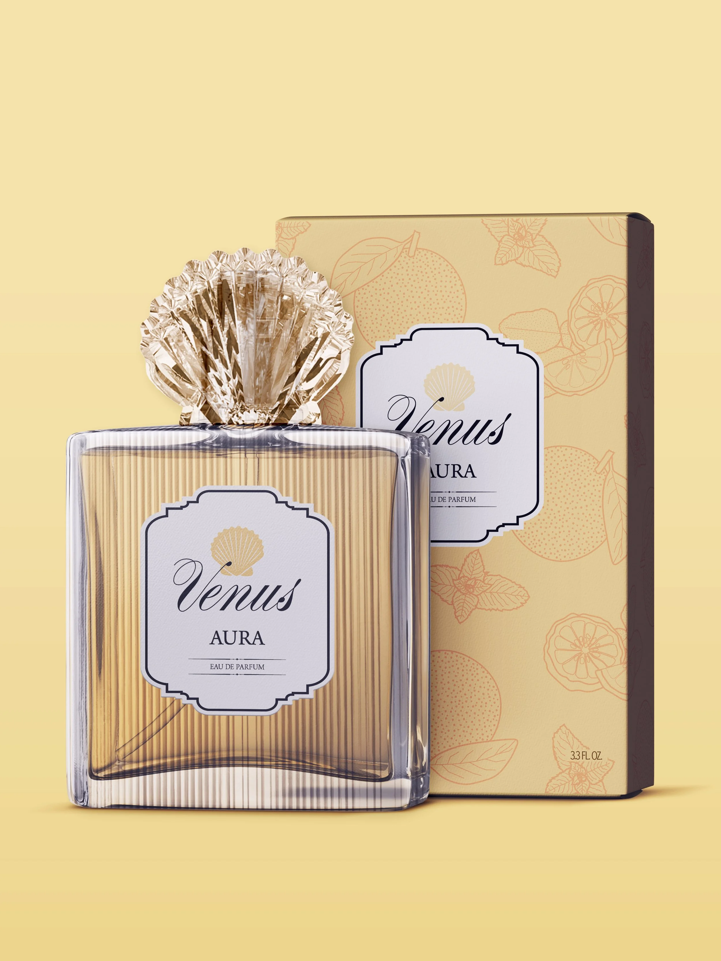
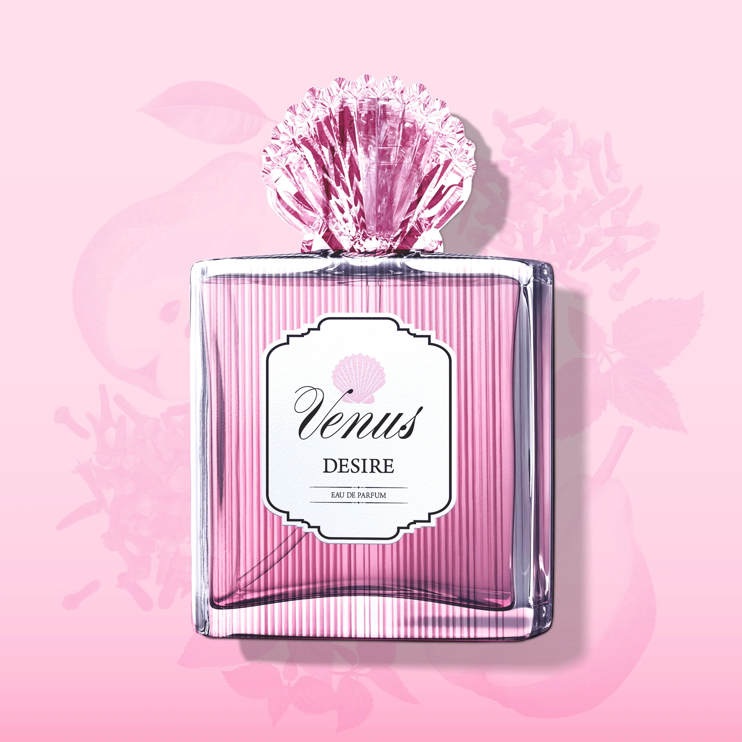
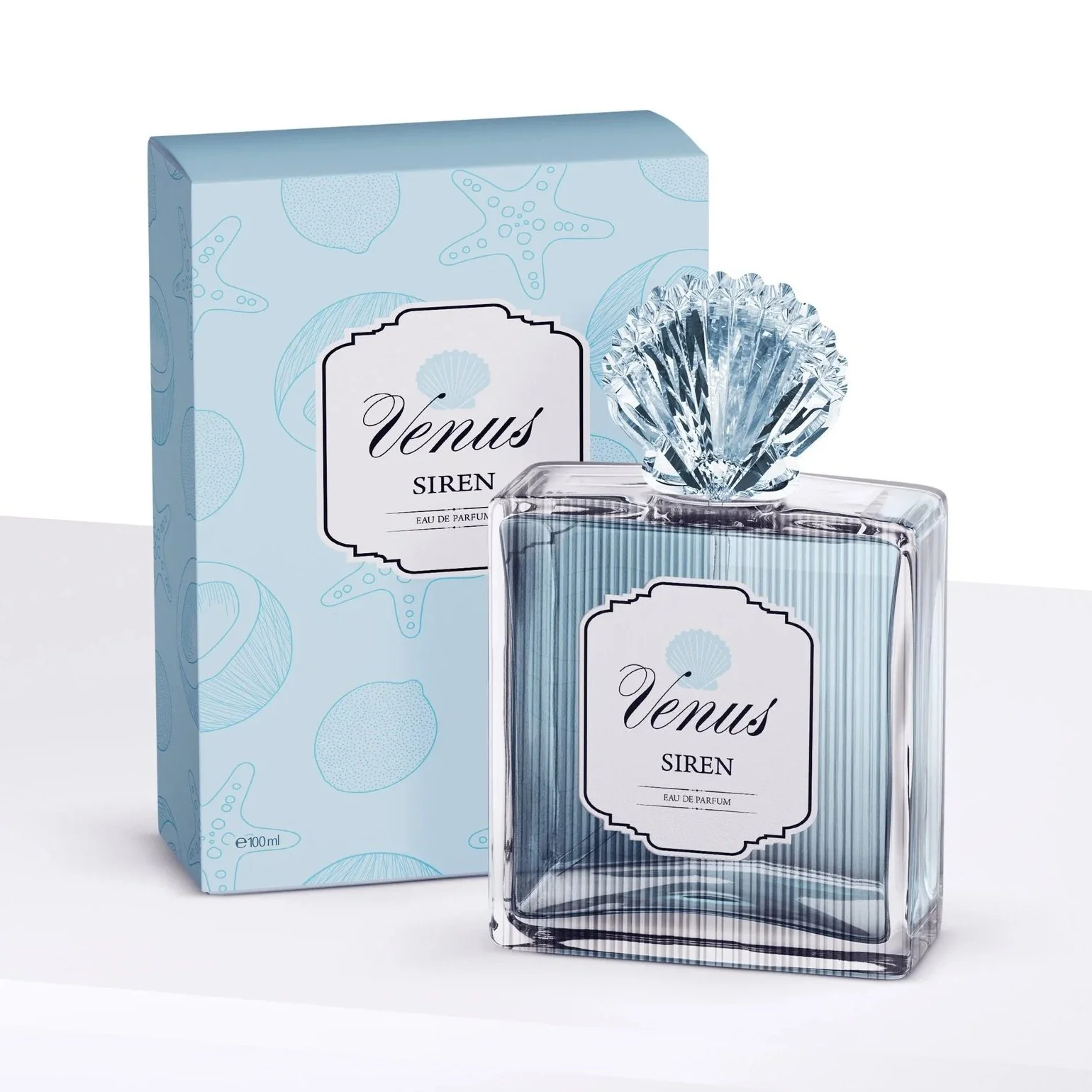
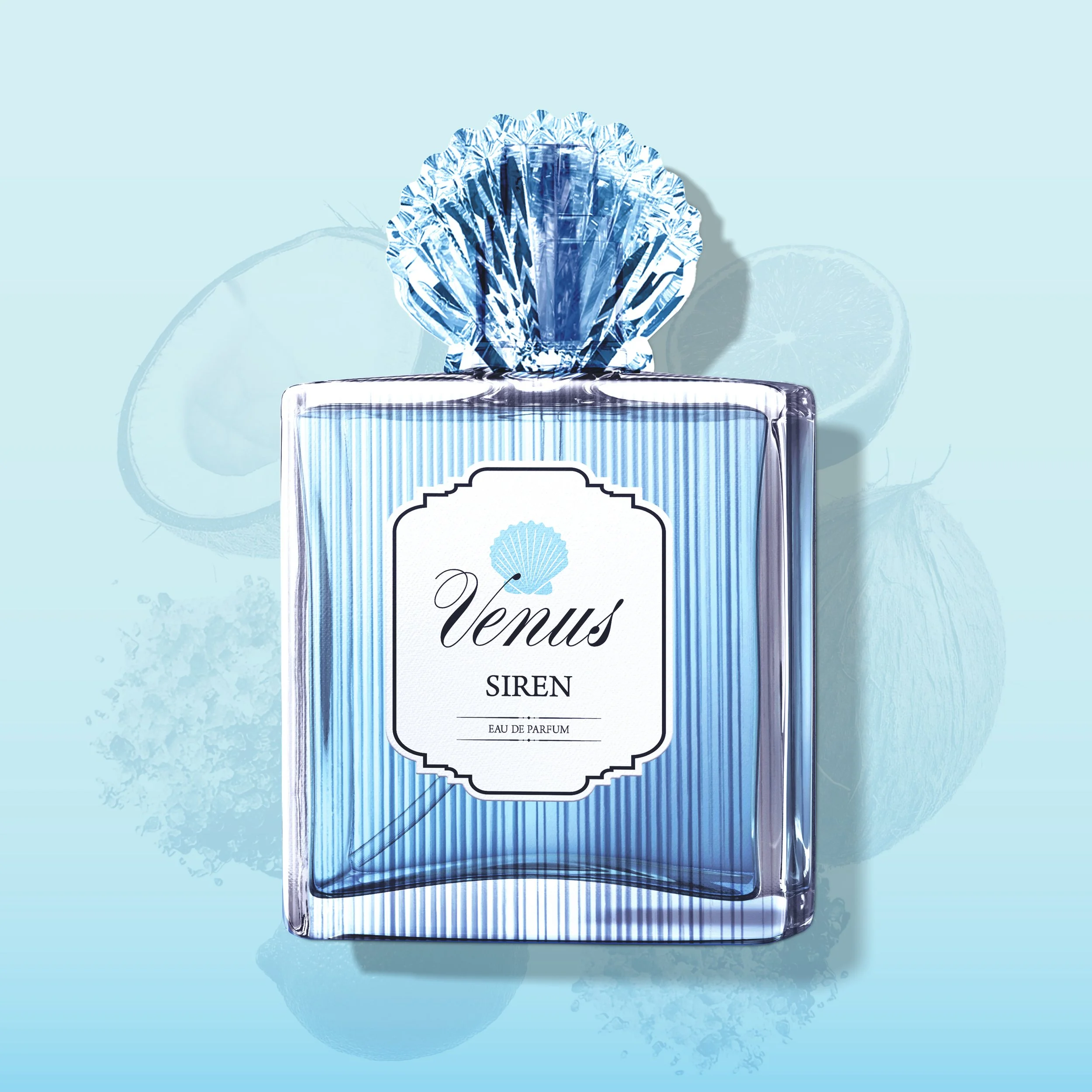
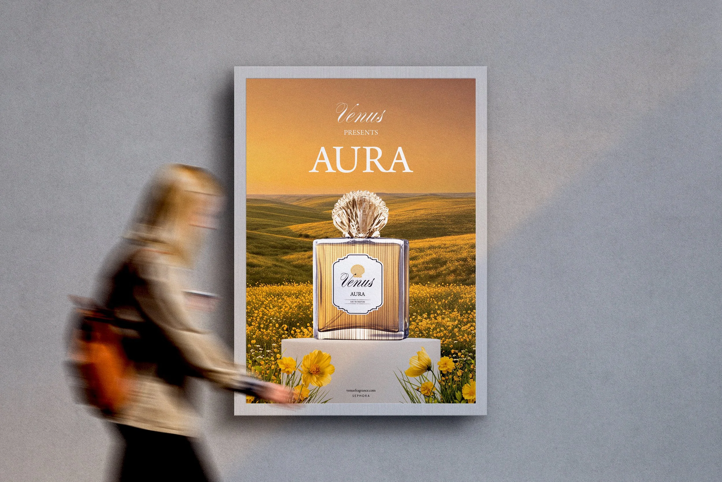
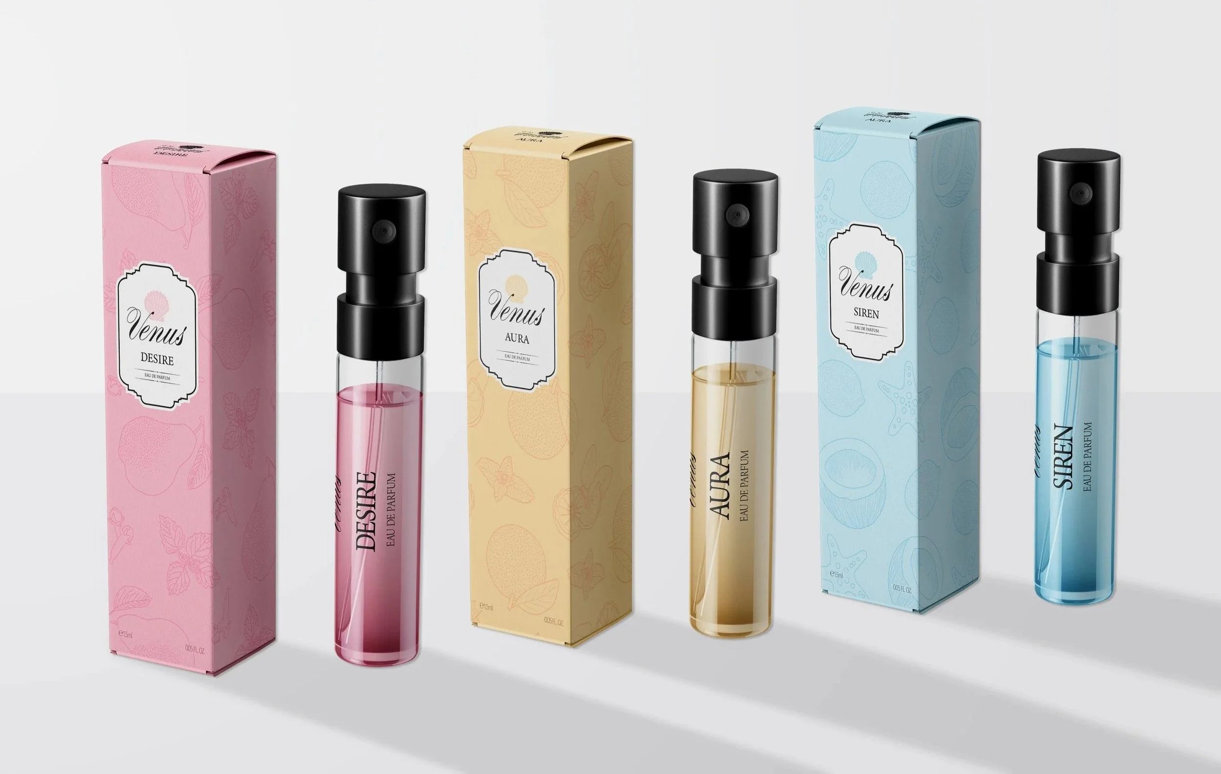
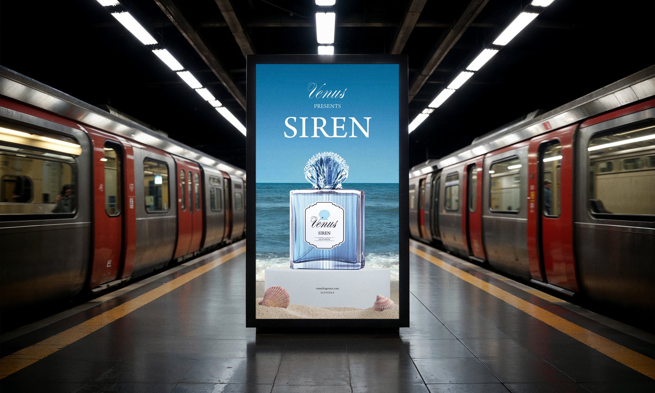
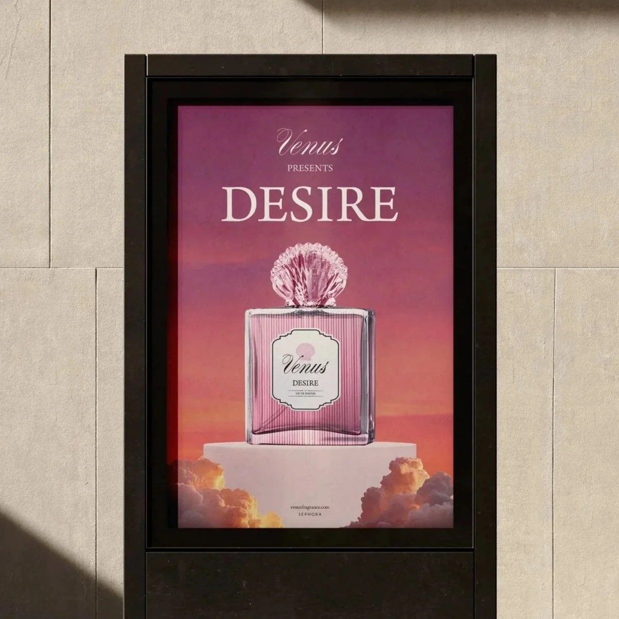
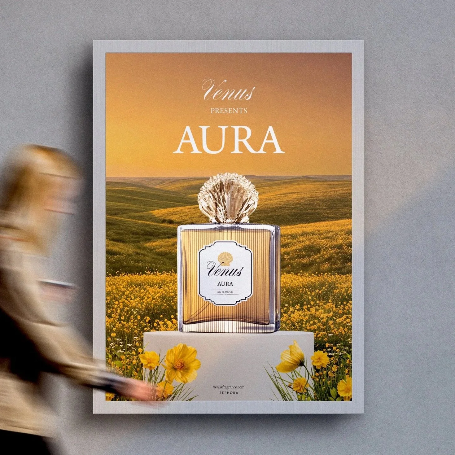
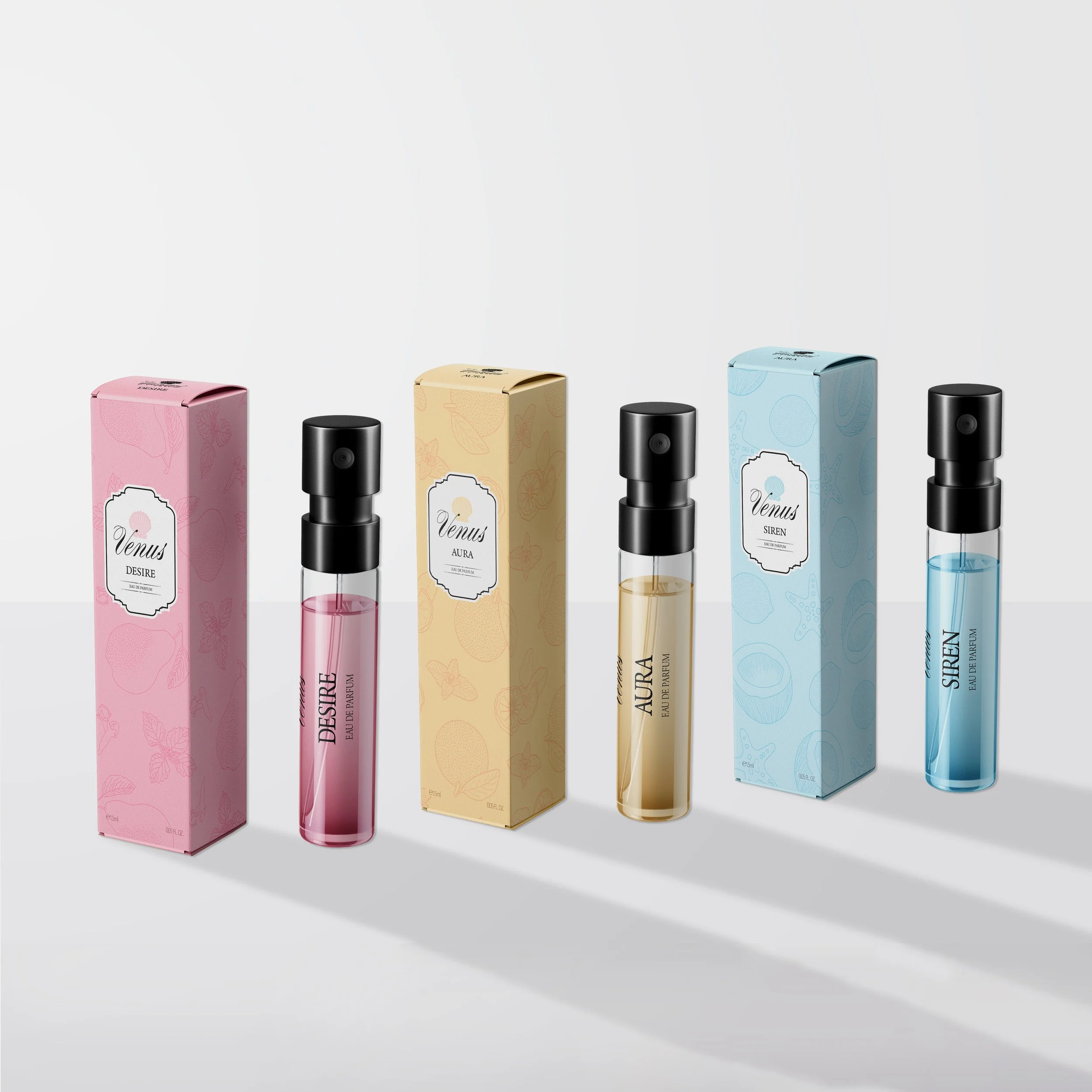
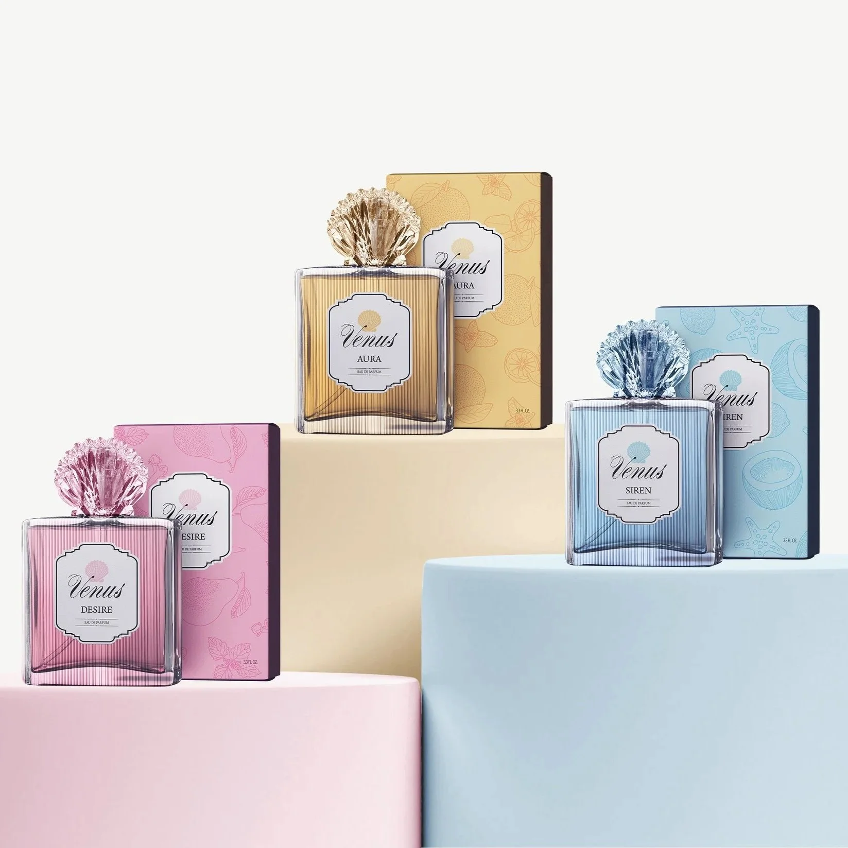
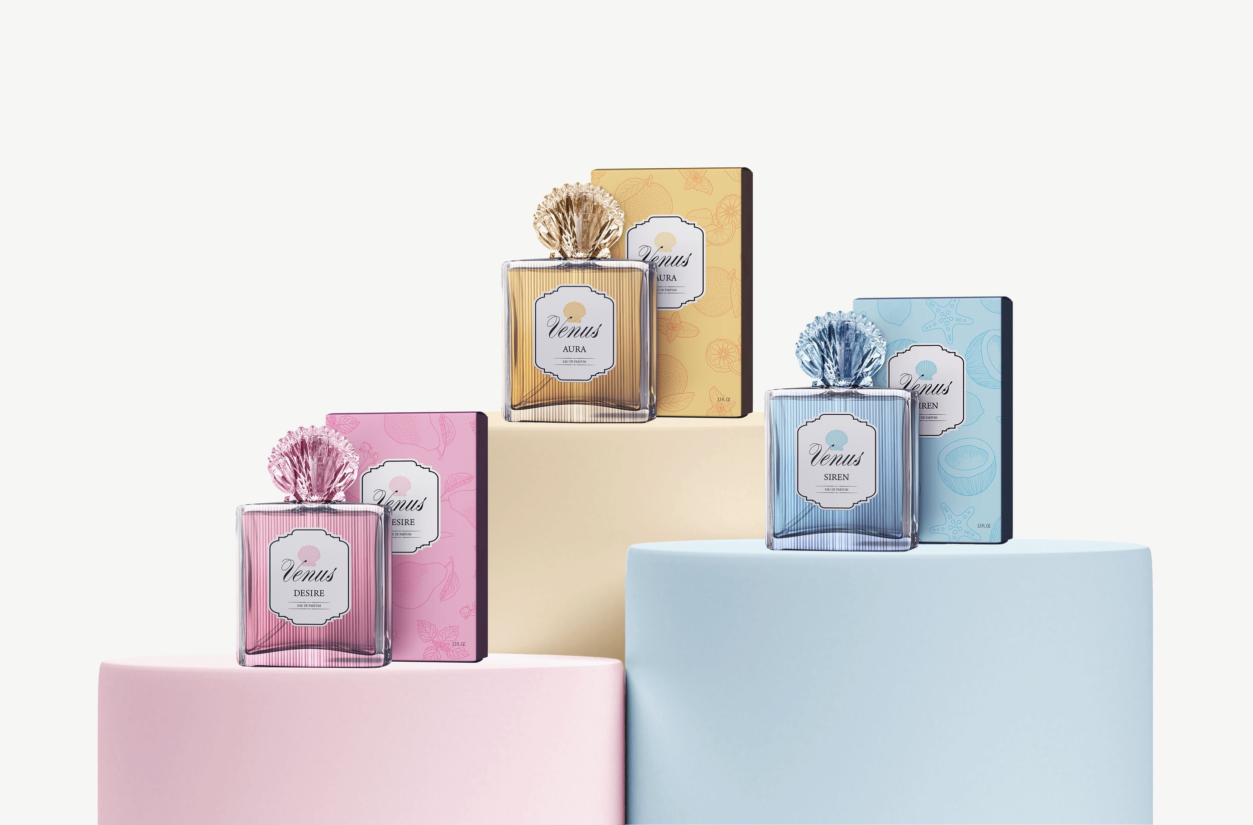
In establishing the feminine luxury central to this brand, I was heavily inspired by the coquette visual aesthetic (à la Marie Antoinette). I knew that the bottle itself - beyond just the label design - had to feel opulent in order to place the product fully in the luxury category; think Sephora rather than Ulta. For this reason, I focused as much of my attention on the physical construction of the bottles as the other branding elements. In fact, I figured out how to use Illustrator and Dimension to make elaborate glass elements (the shell topper and ribbed texture) for my mockups.
I decided to keep the logo and bottle labels simple and restrained to enhance that “expensive” feel; I selected a classy script typeface and illustrated a clamshell silhouette for the logo, chose a sophisticated serif for my secondary typeface, and designed my labels in the shape of ornate frames to create a sense of timeless elegance.