Shiki
IDENTITY | MERCH
background
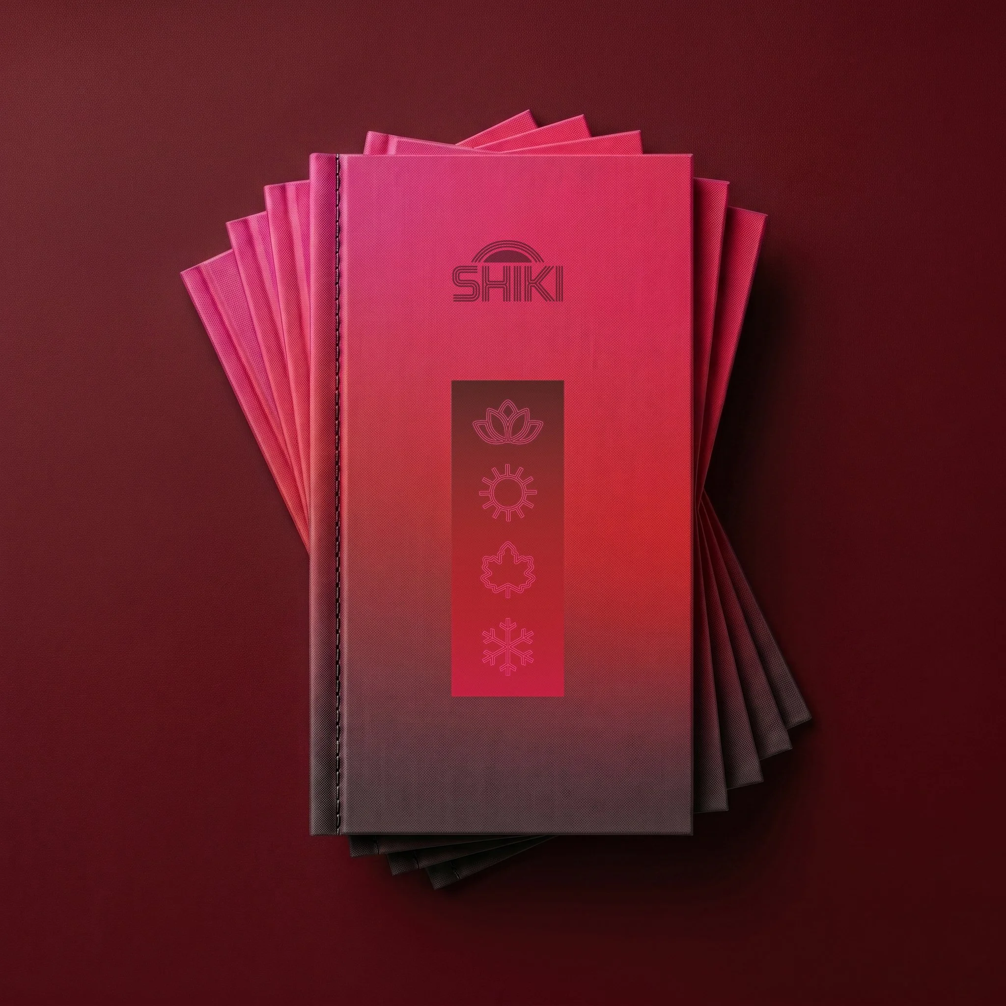
Shiki is a Japanese Kaiseki fine dining concept that honors the ephemeral beauty of the changing seasons with fresh local ingredients and an ever-changing menu. In Japanese, shiki (四季) means “four seasons” and represents a deep cultural reverence for nature’s rhythm. In the context of kaiseki fine dining, this means letting the seasons guide which premium ingredients, flavors, and cooking methods chefs use to create their carefully orchestrated multi-course dining sequence.
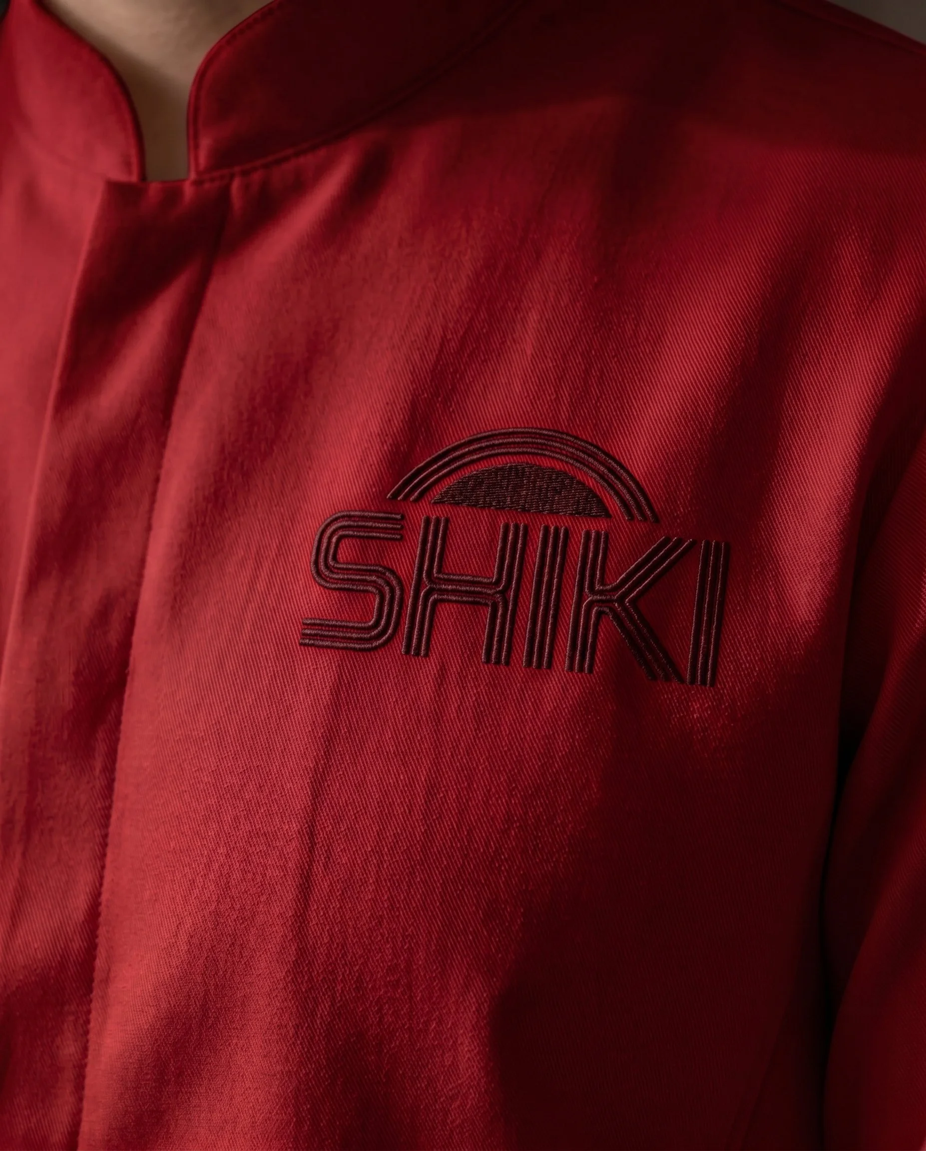
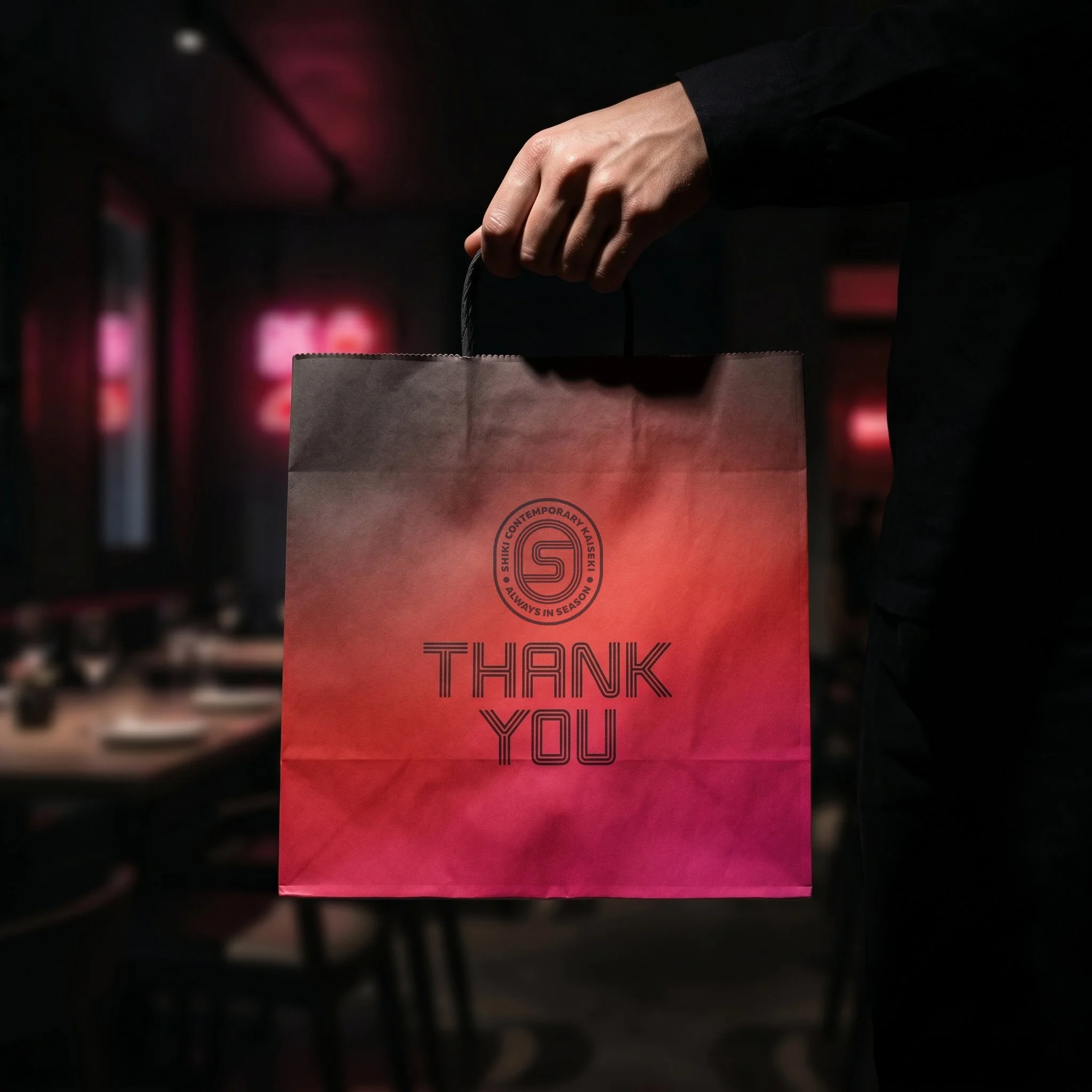
When desigining Shiki’s brand identity and touchpoints, I took a highly conceptual approach that used light as a visual metaphor for the flow of season into season. Shiki’s logo is reminiscent of the neon signs that color Tokyo’s modern nightlife, and like these signs, we can view the seasons as diffused gradients of light that bleed into each other without any definable boundaries, with each moment in time reflecting an inimitable confluence of past, present, and future. This approach allowed me to give kaiseki dining a modern update while still connecting my designs back to the philosophy behind its time-honored tradition.