

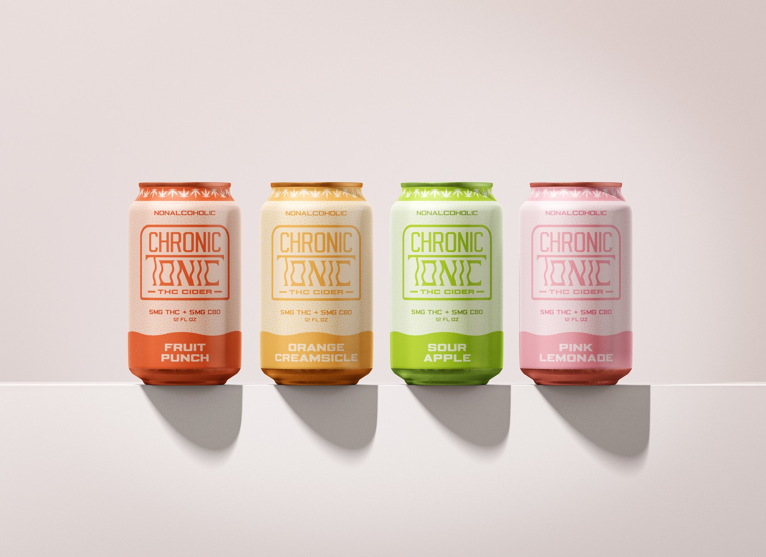
chronic tonic
background
At Chronic Tonic, we believe that adult beverages should taste good and remind you of the good ‘ol days - that’s why we’re proud to make THC cider that tastes like the delicious childhood treats you know and love. Indulge your inner child and drink like a not-so-grown grownup. And get a nice high going, while you’re at it.
Discovery
For this packaging project, I knew I wanted heavily in a typographic direction that had some groove to it. I sourced inspiration from typographic packaging projects that brought some organic funk.


sketches
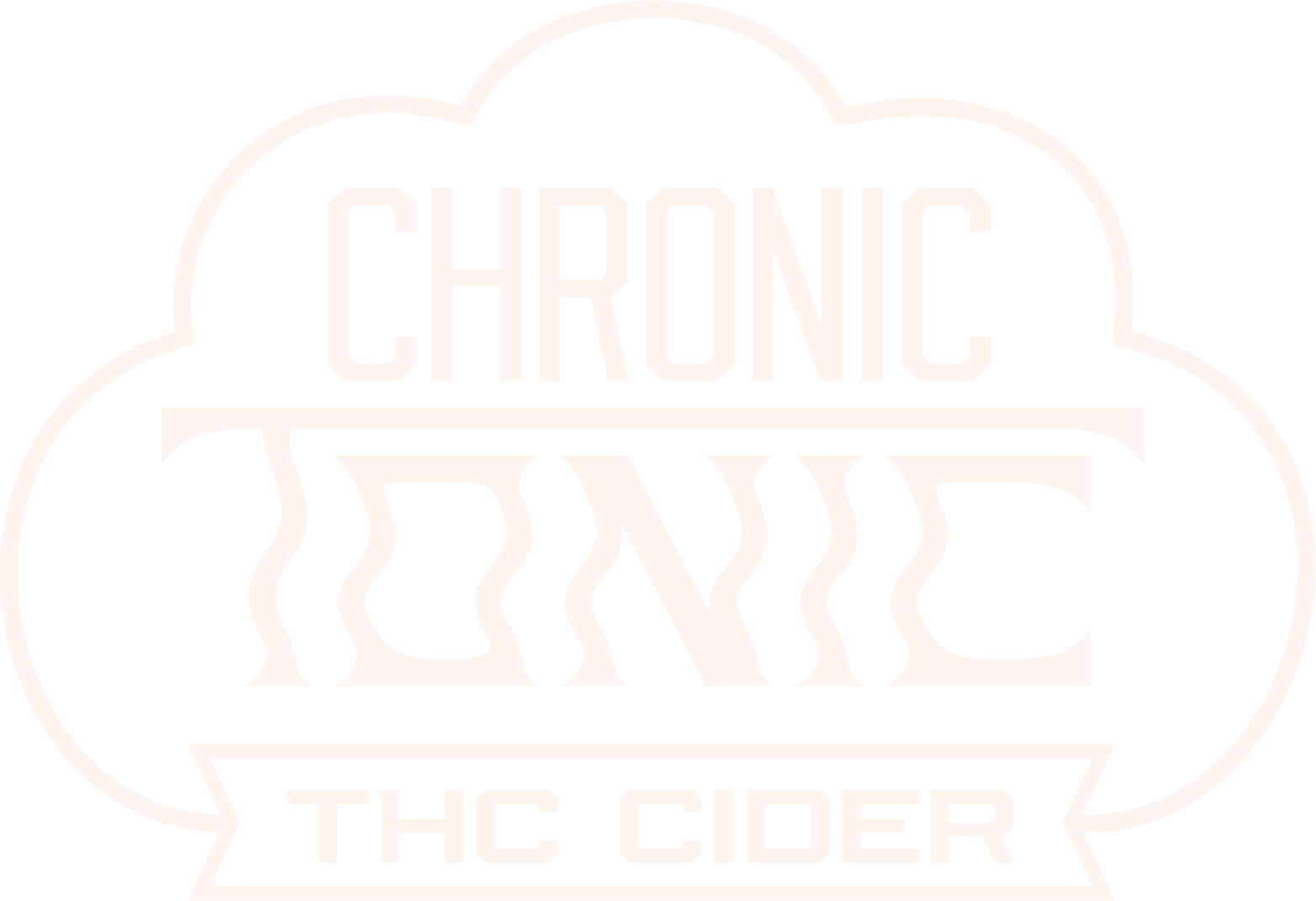
This is one of those projects where I find my footing in one of the first sketches; I knew after sketching the typographic logo with the wavy “tonic” that I had my direction, but I tried a few other things, anyway. It ended up paying off, because I combined a few ideas together to make the final lockup.


drafts
While on the right track in terms of grooviness, my initial label and box drafts relied too much on artificial texture rather than typography. For my final packaging, I got rid of the unnecessary texture, and I played a little more with color to create a relaxed but fun feel. I also realized that the logo lockup looked like a hat, which wasn’t going to work.


typography

final designs


reflection
This was a fun, relatively easy-going project for me (which is appropriate due to the subject matter). It took me a minute to find the right color palette and force myself to quit it with the unneeded texture, but I’m happy with this funky little packaging project.