

venus fragrance
background
Venus delivers divine feminine fragrance fit for a goddess. Indulge in luxury with our signature scents Desire, Aura, and Siren - we promise you’ll fall in love with each heavenly drop.
Effortless. Divine. Venus.
Discovery
For this fragrance branding project, I sought to capture the ultra-feminine, luxurious coquette aesthetic (a la Marie Antoinette) to appeal to young femmes looking to invest in fine perfumes.

sketches
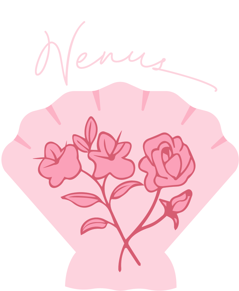
My first sketches focused on pictorial logos of various symbols of the goddess Venus; I remained fixated on the shell, however, due to its shimmering, delicate nature and admittedly its current trendiness with young women.
My later label sketches then played with a variety of lockups, both with and without shell imagery.

drafts
I went through a myriad of different shell logos and typefaces but kept running into readability and cohesion issues; I struggled to find the right combination of elements that achieved a luxurious, ultra-feminine feel without sacrificing legibility.


assets and typography

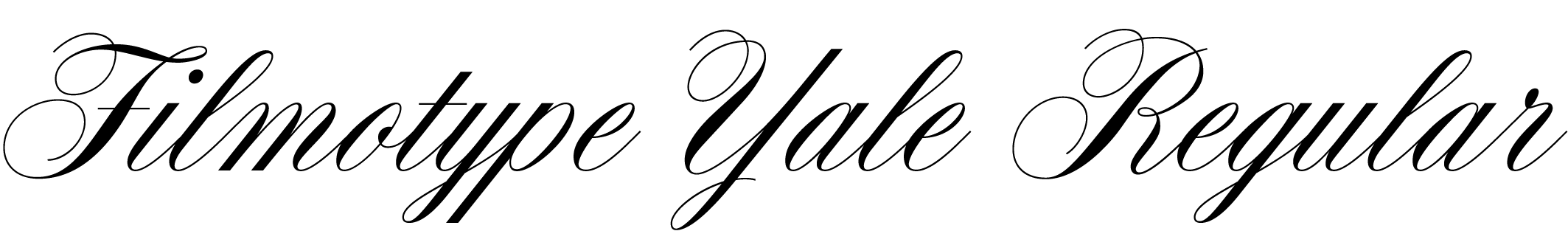
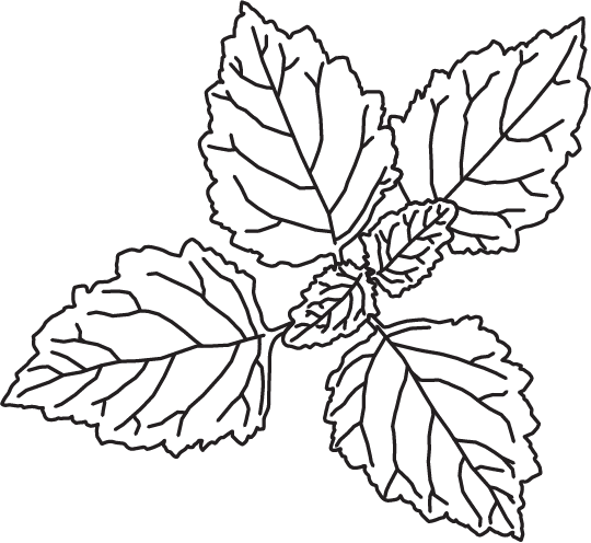
Once I honed in on three scent profiles, I created some simple line illustrations to be used in patterns for the packaging. I also finally settled on the main typeface for the Venus logo and the brand’s supporting typeface.


final designs


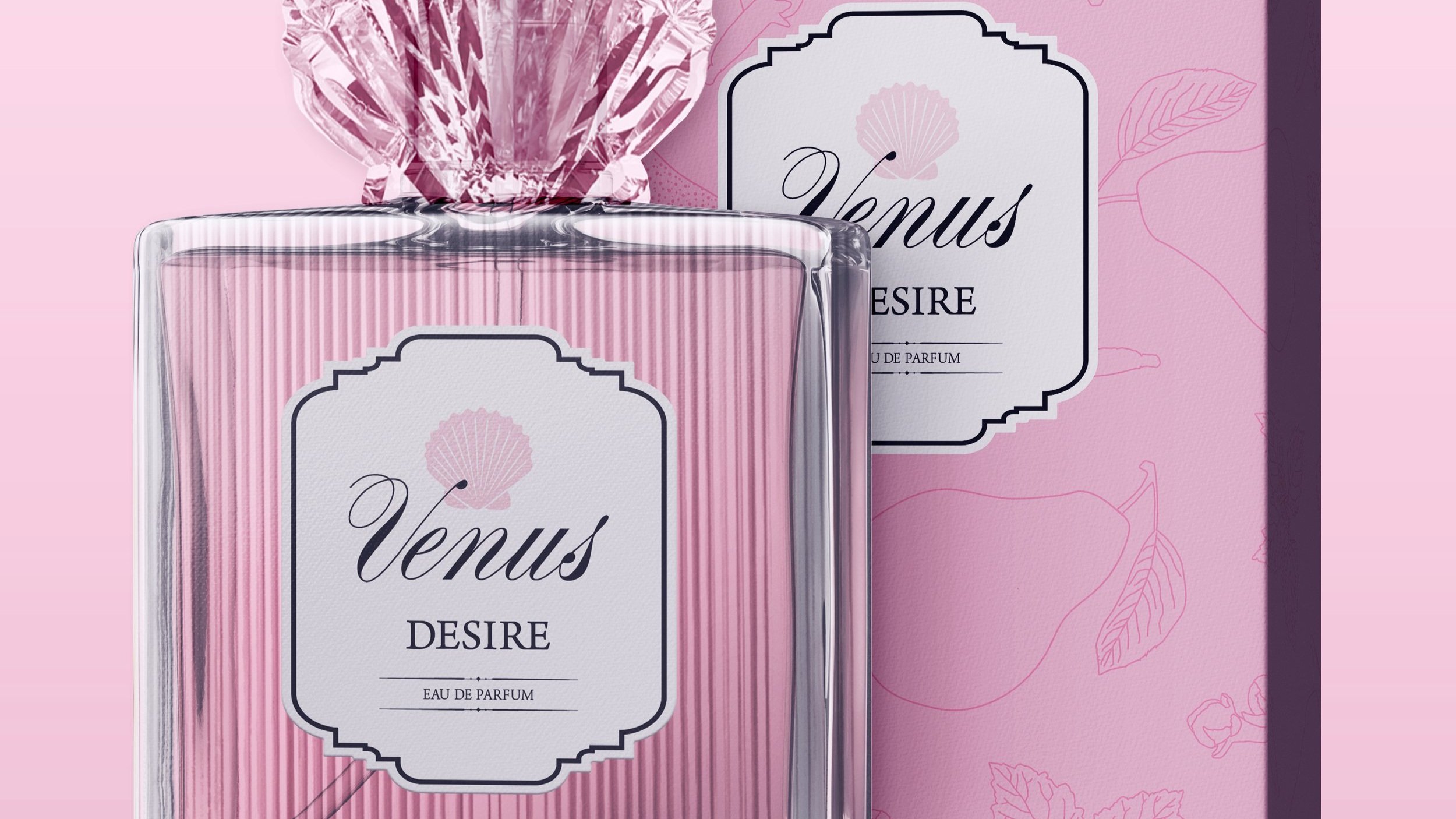
desire


aura


siren


reflection
I am very pleased with this project, though it was by far the most difficult.
Firstly, I spent a ton of time on mockups for this project - I had my heart set on a glass topper shaped like a shell for the main perfume bottles, and because I couldn’t find a mockup with this of course, I made it myself using Adobe Illustrator and Dimension. I also used these programs to make a ribbed glass texture for my bottles to give them an extra boost of elegance.
Ultimately I had a very hard time creating a cohesive system of design elements that all worked together, but I do believe I succeeded in producing a beautiful branding project that perfectly embodies feminine luxury.